I discovered this meme on social media just this morning and wanted to share. This about sums it up, don’t you think?

Encore! Old Pianos with a New Song
Giving new purpose to old pianos

I discovered this meme on social media just this morning and wanted to share. This about sums it up, don’t you think?
Welcome back to my piano art studio. Today’s feature combines a new-to-me technique with some seemingly hopeless piano pieces.
Rather than play games on my phone, I like to watch YouTube videos to get new ideas for my creative side. For weeks I binge watched about a half dozen different artists using the fluid acrylic painting technique. It was fascinating to see how the colors swirled around on the canvas. To be honest, at first it didn’t much look like “fine art” to me—you, know “anyone could do that”—until I tried it, that is. Getting the consistency right, getting the quantity right, spreading it around without causing the colors to combine, getting it to dry without cracks—all these things take practice. And yes, I’ve had some fails, as I’m sure the YouTubers have too. There is a learning curve, but it’s true that it’s a more attainable form of art than, say, portrait painting.
When I opened one of the pianos that were donated to me, I discovered that nearly all the felts had popped off the hammer cores. Most manufacturers staple them in place, but some use only glue, and glue does not hold up well to heat and high humidity. At first I thought I’d try to glue them back down, but then I found that the felts had also shrunk, since they had evidently been in this sad state for quite a while. So, I had no choice but to finish removing the felts from the hammers.
This left me with a lot of pieces I’d never used before. But given enough time, I found a use for them. To begin with, I cut the cores off the hammer shanks, cut the shanks off the butts, then sanded all the rough edges. The butts went into one drawer for future use, and the shanks went into another.
Then I turned my attention to the cores, and I discovered that they are not all the same size. The ones with ‘fat’ felts on them, which strike the heavy strings at the bottom of the keyboard, are short and stubby; while the cores that were once covered with thin felts (for the higher, thinner strings) are long and thin. And there is a third size in between those two for the hammers in the middle of the action.
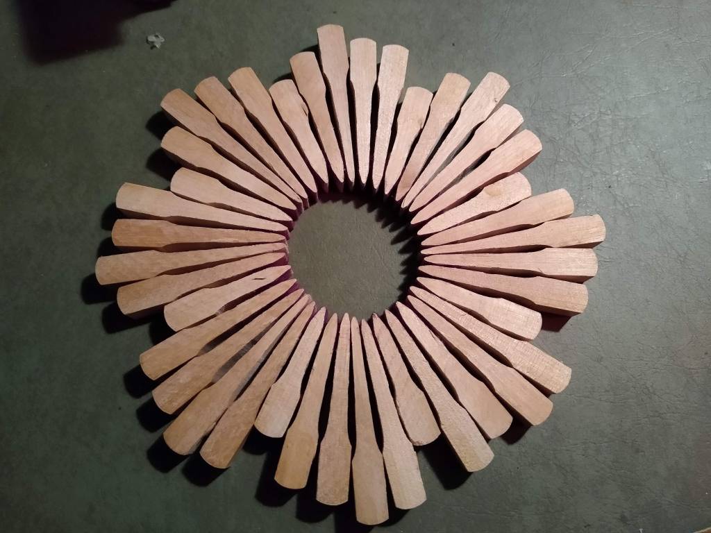


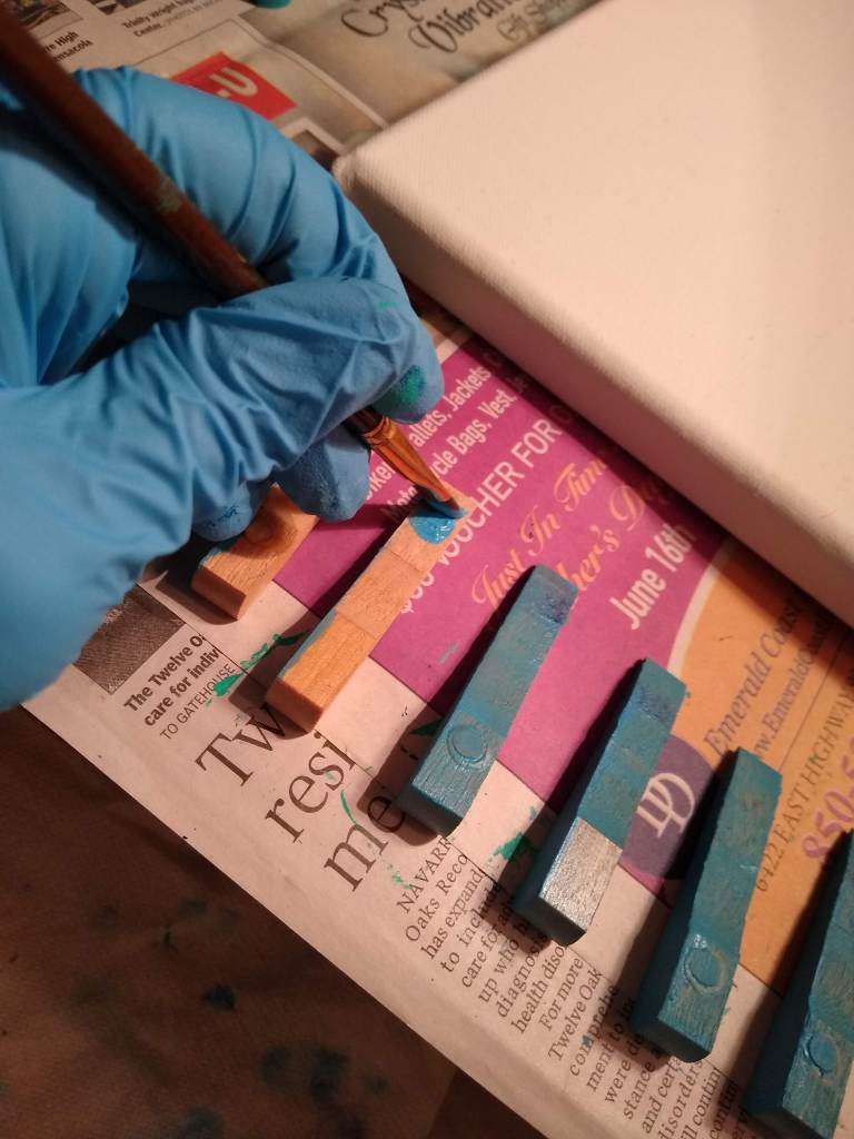

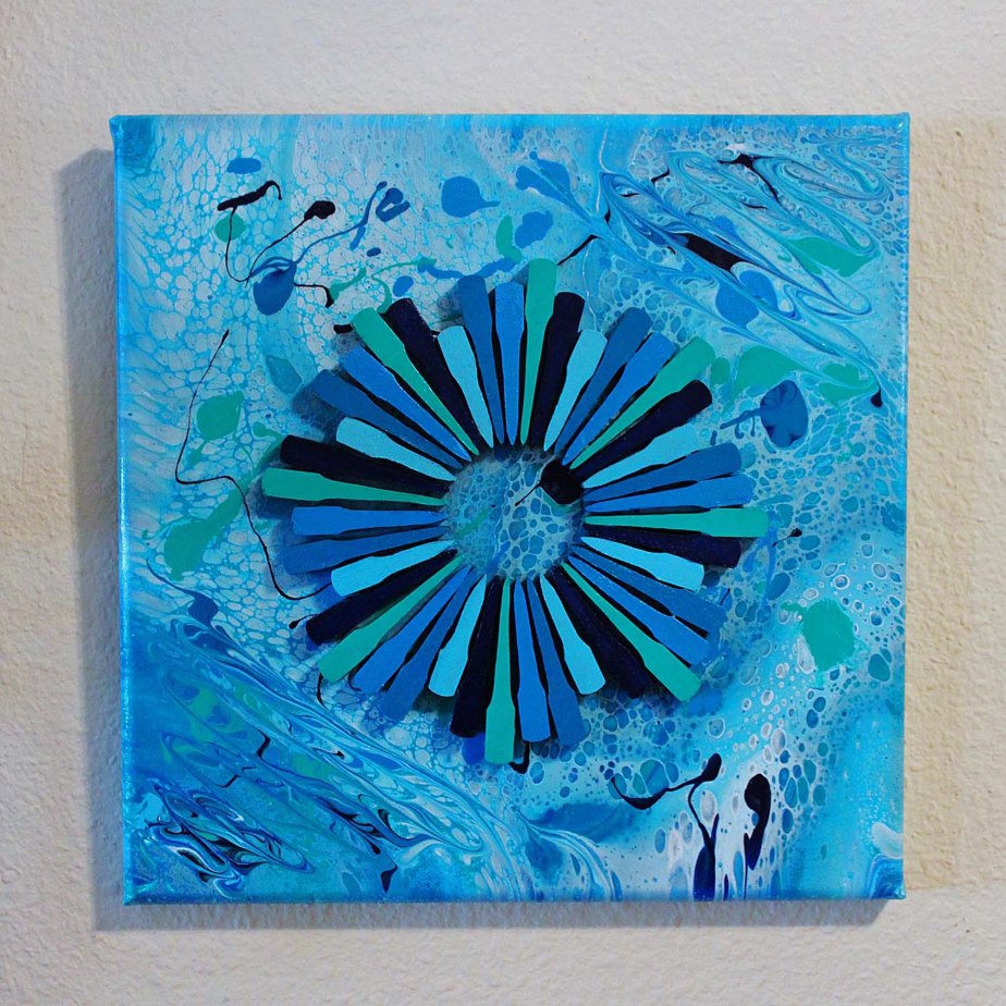
Because the acrylic pouring technique yields an illusion of fluidity, I decided that for my first paint pour I’d use the colors of the ocean. I made two of them, each on a 12″ x 12″ canvas, and not surprisingly, they look quite different from one another. For the first one, I painted the hammer cores from that sad piano, using the same colors that were in the watery background, then arranged them in a circle on top of the canvas. On the second canvas, I combined the cores from various pianos, both upright and grand, and so got a slightly different look. The grand piano hammers made the difference because they’re curved at the tail, as opposed to their stumpy upright counterparts.


For me the hardest part of creating something new is coming up with a name for it. Because my focus is pianos, I decided a long time ago to give each piece a music-themed title. Sometimes it’s a musical term that I think aptly describes what’s happening on the canvas. Other times it’s the name of a song. In this case, it’s a phrase from within a song. In fact, the song played through my mind constantly as I worked. It’s a hymn that has been set to a few different tunes, and it’s called “O the Deep, Deep Love of Jesus.” My church hymnal presents it with a traditional Gaelic melody (Bunessan) in the Key of C. But my favorite setting is the lovely minor key tune, Ebenezer, composed by Thomas J. Williams.
O the deep, deep love of Jesus,
Vast, unmeasured, boundless, free!
Rolling as a mighty ocean
In its fullness over me.
Underneath me, all around me
Is the current of His love;
Leading onward, leading homeward
To my glorious rest above.O the deep, love of Jesus;
Spread His praise from shore to shore!
How He loveth, ever loveth,
Changeth never, nevermore.
How He watches o’er His loved ones,
Died to call them all His own;
How for them He intercedeth,
Watcheth o’er them from the throne!O the deep, deep love of Jesus,
Trevor Francis
Love of ev’ry love the best!
‘Tis an ocean vast of blessing,
‘Tis a haven sweet of rest.
O the deep, deep love of Jesus,
‘Tis a heav’n of heav’ns to me;
And it lifts me up to glory,
For it lifts me up to Thee.
Now that you’ve read it, I invite you to listen to a stunning arrangement of my favorite arrangement of this song….
Both paintings are available for sale, the original and the second one.
Thank you for joining me on this tour of the studio. I look forward to seeing you on the next one. Until then, I invite you to check out photos of my other work in the gallery. Enjoy the rest of your day!
Welcome back to my piano art studio. Today I’d like to take you inside my head to see how I thought through the idea that eventually came to be known as “Love Letters.” I hope you enjoy the read.
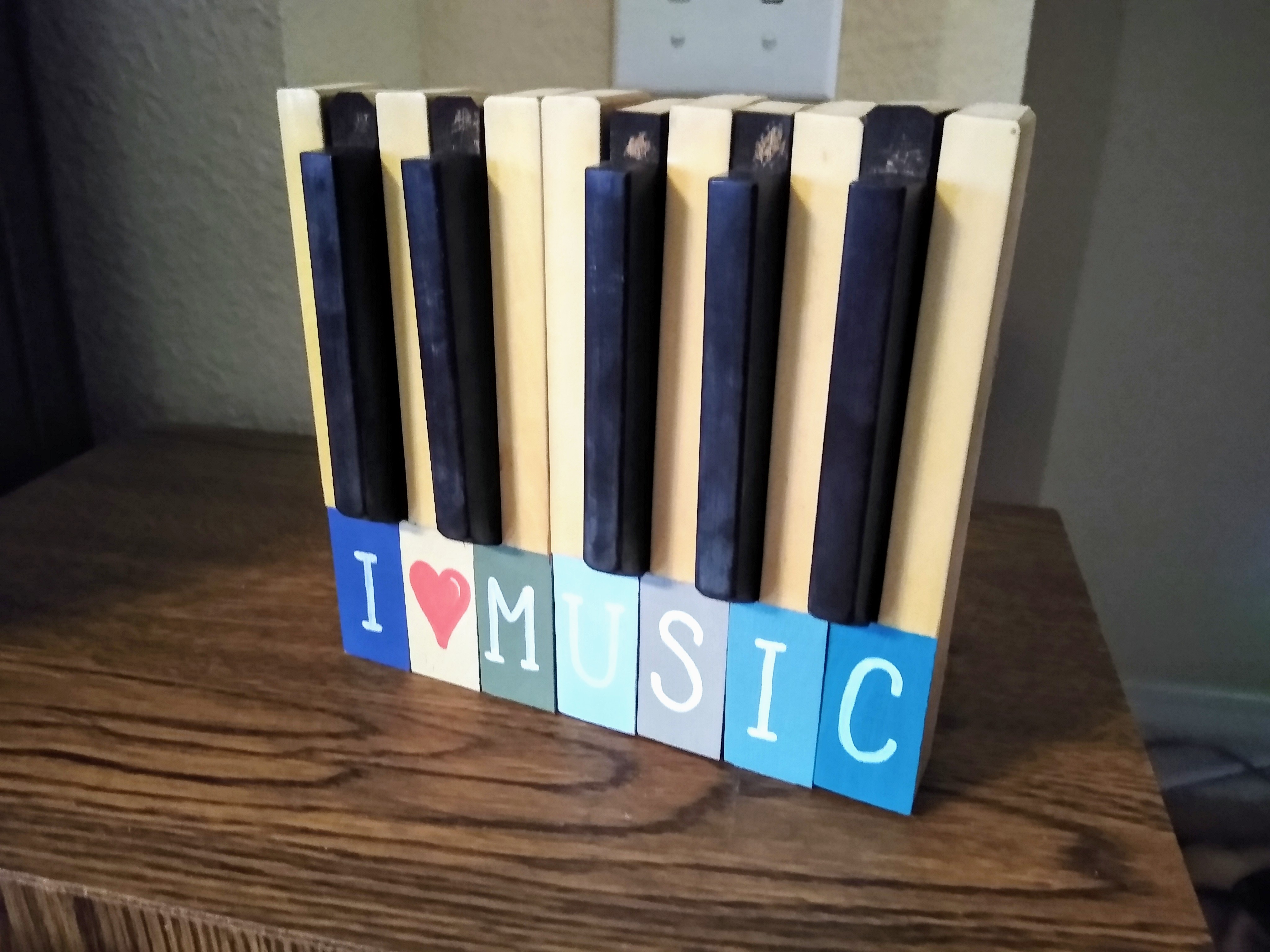
One day as I was sorting through my bin of ivory keys, I found that I had attained quite an assortment of miscellaneous keys that had lost their ivory keytop heads. What am I going to do with these beauties?
To begin with, I need to sand the heads smooth. . . .
Ok, that’s done. Now what?
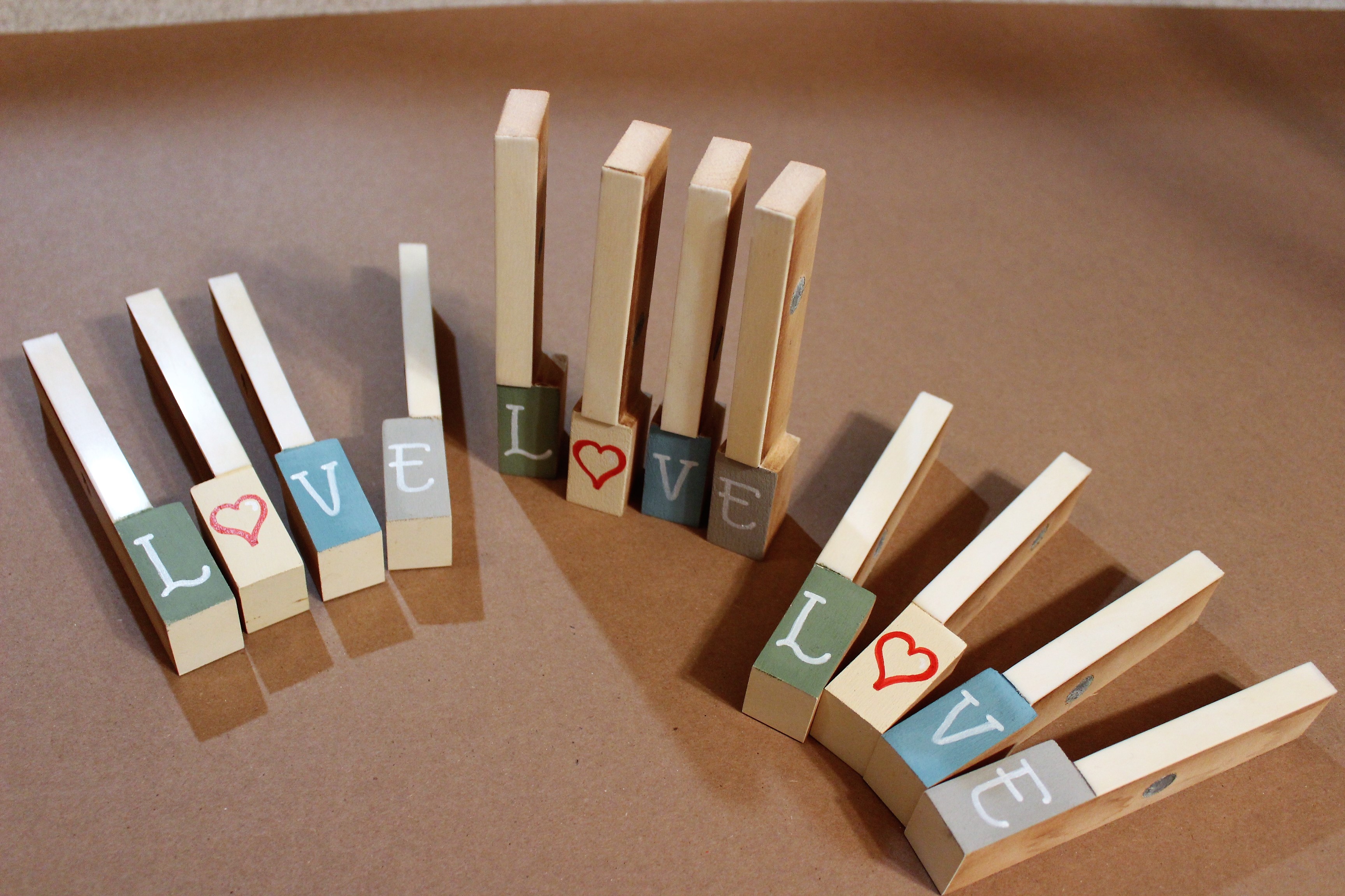
I browsed Pinterest and the home decor section of local stores, looking for ideas, and I saw several messages written out with wooden blocks.
I can do that! Each key will represent a block, and I can write the letters on the keytop heads.
But what will I write? What message should these musical blocks display? Ah, yes! “I love music.” It’s a no-brainer. And I’ll use a heart to represent the word “love.”
This will involve seven keys, so I’ll need seven paint colors. The heart will be red, so I want the background to be white. As for the others, I’m not sure just yet.
Upon counting the keys I had available, I decided to make two sets of I♡MUSIC. But I still had keys that were missing their keytop heads. In fact, I had 16 more. That would be enough for two more sets, but I’d have two left over. What other words could I make? How about “LOVE.” And I’m creating these to be home decor items, so the word “HOME” also sounds appropriate. I’ll make two of each: one in warm colors and the other in cool colors, to match any decor.


With chalk paint becoming more and more popular, I’ll try it out on these key-blocks. I went to the store and browsed the chalk paint selections, choosing six colors that coordinated with one another, plus black, white (plaster), and red. These will do nicely.
At home, I set out all the bottles of paint, rearranged them several times, taking pictures of the bottles to see how the colors looked when photographed. There. That’s good. When I had the colors arranged to my satisfaction, I carefully painted each head.
Next question: What font am I going to use for the letters? For help with that, I went back to Pinterest, browsed until I found a few different styles I liked, then practiced in my sketchbook. Yes, this one. I can duplicate it with ease, it’s easy to read, and it has a simple elegance to it.
When the paint was dry, I wrote letters on the keys, one on each head, and put them together to spell “I♡MUSIC,” “L♡VE,” and “HOME.” I made some available in cool tones and others in warm tones. I’m so pleased that the keys stand on their own and can be positioned however I like. When finished, I made them available for sale both online and locally.


Several craft fairs later. . . These Love Letters are nice, but I’m getting tired of having to put out each individual key at every single craft fair. And the wind knocks them over. And they fall when people bump the table. If they annoy me, they’ll annoy my buyers. Imagine having to move each key individually when it comes time to dust! What a pain! It’s time to improve the design.
So I decided to glue them together. Ah, yes! an instant improvement. They do require a little reinforcement on the back, though, since they weren’t made to go together so closely. But I have lots of thin plywood on hand, so that’s not a problem.


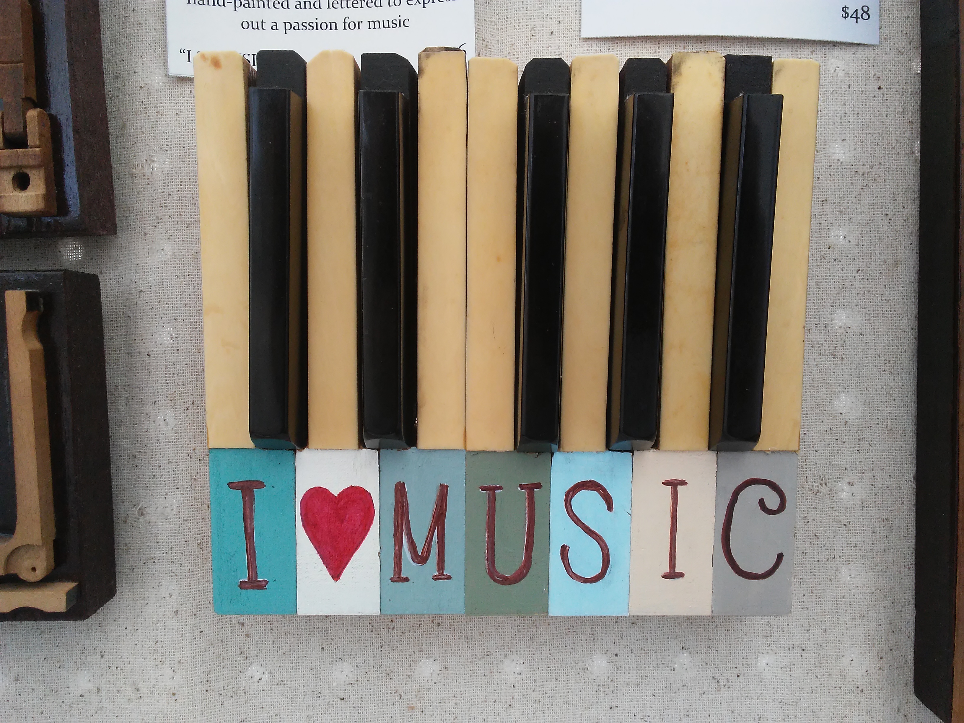
The next change came to the “I♡MUSIC” selection. My husband made a recommendation: “Why don’t you include the ebony keys between the ivories, as they appear on the piano?” Good idea. I’ve since made several that way. They do look nice, but they present another challenge to me: they have to come off the piano in proper order. The way I’ve been putting them together, the keys could be from anywhere on the keyboard. I’d simply gather the keys that were missing their keytop heads and mate them together. But ebony keys don’t fit between, say, two C keys. You have to have both C and D side by side. So while it’s possible to include the ebonies, I won’t make them that way exclusively from now on.
One advantage, however, to including the ebonies is that I can back the entire piece with thin plywood and install a sawtooth hanger, making the piece more versatile. For with a sawtooth hanger, the décor may either stand freely on a shelf or be displayed on the wall. Where there are no ebonies between the ivories, there isn’t a place to attach a sawtooth hanger. Granted, I could use two smaller hangers, one on each end. I’ll think about it. . . .
Some of the Love Letters are still in stock, including I♡MUSIC and HOME. Incidentally, I changed up HOME a bit, so that it now says, “With You I Am HOME.” I did this after hearing that expression used in not one, but two movies. It’s a sign! ☺
Thank you for joining me on this tour of the studio. I look forward to seeing you on the next one. Until then, I invite you to check out photos of my other work in the gallery. Enjoy the rest of your day!
Welcome back to my piano art studio! I’d like to share with you the power of a friendly suggestion.
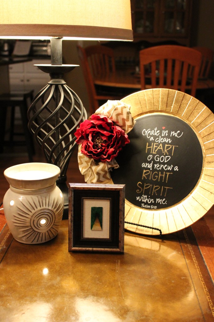
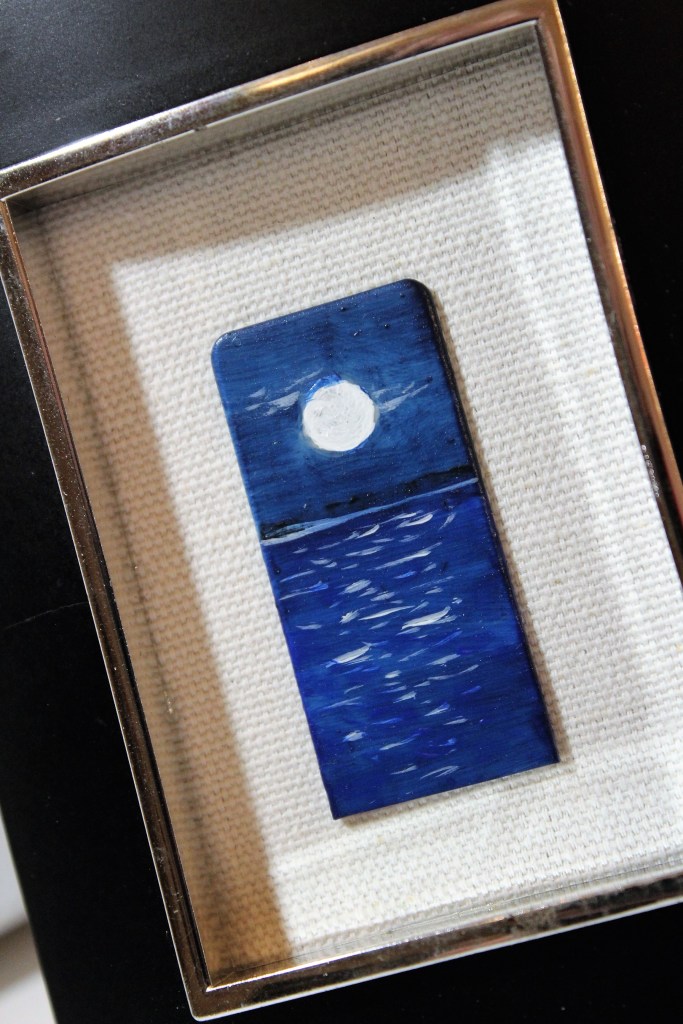
One day a couple years ago my friend Adele approached me at church with a piece of piano art someone had given her. The scene was of a country road winding through the woods and beyond a small cottage—all this painted on an ivory keytop head, which measures less than 1 inch by 2 inches. I was amazed at the detail that could be captured in such a tiny painting. The setting was equally stunning, as the painted keytop was set on a background of black velvet and enclosed in a 2½” x 3½” frame. “I believe you can do this too,” she said.
I’d never painted anything so small before, but I rose to the challenge. At home, I got out a sheet of canvas paper, traced several times around an ivory keytop head, then set about to paint a variety of settings within the constraints of my small rectangles. I wanted them to be my own, not a copy of the one my friend had shown me. Each setting was from a place I had been. Several were from photographs I’d taken, but a few came from my memory.
When I had painted seven scenes, I chose four of them to duplicate onto the actual ivories. I decided to create eight copies of each of scene, so I fastened 32 keytop heads to a paper sack with a small piece of rolled painter’s tape under each one.
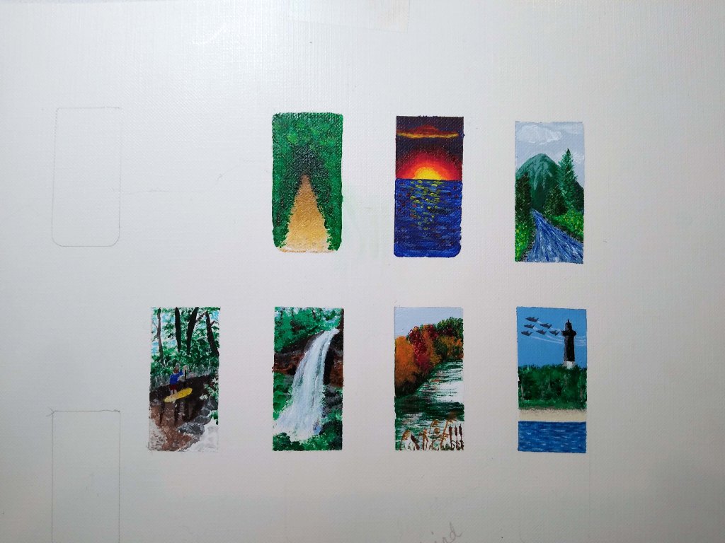


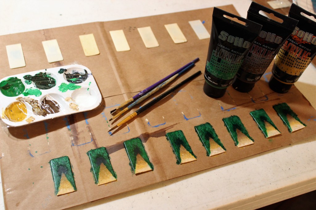
Right away I learned that painting on the smooth ivory surface is much different from painting on the canvas paper. It took layer upon layer of paint before the picture began to emerge. (Now I prep the keytop head with a coat of sealer before painting, as it gives me a better surface on which to apply the paint.) Then using my smallest (liner) brushes, I set out to create what I hoped would be masterpieces—or at least identifiable scenes from nature.
When the paintings were complete, I borrowed from the other artist’s idea of mounting the keytop head onto a piece of black velvet in a small frame. This size frame is easy to find, but finding one that doesn’t look cheap can be a challenge. I cut the fabric down to size and mounted it to a piece of sturdy cardboard, also cut to size. The glass that had come with the frame was set aside for a possible future use.


In addition to painting canvases and repurposing pianos, I also enjoy writing poetry. That said, I decided to write a short poem to go along with each painting. Three of them came out five lines long, which stands in perfect proportion to the keytop head. But for my favorite scene, the Blue Angels and Pensacola Lighthouse, I wanted something different. I had recently been to a show, and my mind was still filled with national pride in the skill and strength of our military. No, this one needed more than five lines of poetry! So instead, I wrote a shape poem in the form of a jet with its gray/white streaming contrail. Then with a bit of trial and error, I came up with a suitable display of both the poem and its accompanying miniature painting. To frame it, the Ocracoke design by Better Homes & Gardens, which looks like shiplap, was perfect. (Note, this style has apparently changed ownership. It’s now carried at Walmart under the Mainstays brand and in other stores under the name of Philip Whitney.) I also added a flourish of shells collected off the Pensacola Beach.


With the exception of “Angels and Light,” my original designs that included poetry were framed as 5×7’s and mounted to either black velvet or unbleached canvas. I printed the poem onto cardstock and layered scrapbooking papers underneath. There was a flaw in this design, however. By taking these items to craft fairs, I learned that they don’t hold up well under the Florida humidity. I tried several different adhesives, and the only one that worked was fabric glue, which is messy to work with. But I’m constantly watching YouTube videos to see how other crafters work, and I’ve learned a new technique that will greatly improve my design. I look forward to implementing the new ideas in the coming weeks and months. And of course, I’ll share them here when they’re finished.
To date my skipped-over scene ideas remain unused. One of these days I’ll get to them.
But I have painted other settings on ivory keytop heads by commission. My favorite was a recent commission for which I painted a Denver skyline. This was my first mini painting done in landscape mode. It kind of scared me, to be honest, because I had to make it recognizable as the city of Denver, not just a random city with a backdrop of mountains. Evidently I did well, for my customer was pleased. I’m always happy to oblige, and I’m honored whenever anyone asks for a custom piece.

Only a few of my original Ivory Illustrations remain: two small “Black River, White Sand,” and three large “Angels and Light.” As I paint more—and update the ones that include poetry—I’ll also add these to my shop.
If you have an idea for something you’d like special, by all means, let me know. After all, it was a suggestion from a friend that brought Ivory Illustrations to light in the first place!
Thank you for joining me on this tour of the studio. I look forward to seeing you on the next one. Until then, I invite you to check out photos of my other work in the gallery. Enjoy the rest of your day!
Welcome back to my piano art studio! Today I have a series of questions for you—their answers too, of course.
What’s your preference? As for me, I believe random is beautiful in certain situations, but my inclination is toward patterns. “A place for everything, and everything in its place,” right? This is why patterns appear in so many of the things I create from piano pieces. There is order in nature, there is order in music, and there is order inside a piano. Why not create more order from the pieces I find there?
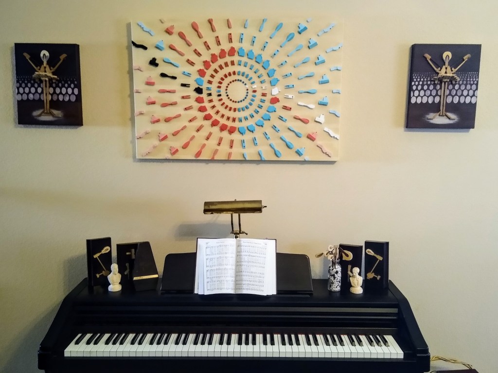
Measuring at 24 x 36 inches, “Riff” is the largest canvas piece I’ve created to date.


To begin with, I selected a variety of piano action pieces from among those I had previously cleaned, separated, and sorted. Then sitting on the living room floor, I arranged them in a three-foot circle. When I was satisfied with the arrangement, I placed them onto a 24×30 piece of plywood. I considered mounting them to the plywood, but changed my mind and went with the canvas instead.
Since the finished product would be rectangular rather than circular, I removed all the pieces that appeared beyond the boundary, leaving me with 196 pieces. The ones that lay along the edge were cut and sanded, to give the illusion of a continuous circle without having to show it in its entirety. I painted the gallery-wrapped canvas in a nice neutral tone, and also hand-painted every action piece. When the paint was dry, I glued the pieces down. To finish the piece, on the back I installed two sets of picture wire and D-hooks—one to use for vertical hanging, and another for a horizontal display. It truly looks good either way.


The circle was divided in half, representing the two parts of a standard musical staff: treble and bass. To color the pieces, I used vermillion on side and turquoise on the other. The parts in the center of the circle bear the darkest hues of each respective color, and the “ripples” which extend from the center grow increasingly lighter in hue. Additionally, I created a wavy line of white running through one side and another of black on the opposite side, representing the ivory and ebony of the keys. These were accompanied by one piece each from the other side, to represent the harmony created by playing the notes together.
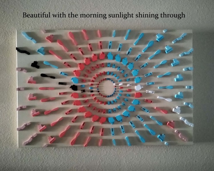
This one was dubbed “Riff,” a term I came across while learning to play guitar. A riff is a repeated chord progression or refrain; a pattern of sound that forms the foundation for the composition. This piece is a pattern in the form of a circle, so the name fits, don’t you think?
“Riff” is currently available for sale. If you’re interested in learning more, simply click here.
Thank you for joining me on this tour of the studio. I look forward to seeing you on the next one. Until then, I invite you to check out photos of my other work in the gallery. Enjoy the rest of your day!

Welcome back to my piano art studio. Please allow me to share with you the latest creation from the Encore studio and the thought that went into it.
One of my favorite things about creating piano art is getting to participate in local craft fairs and art shows. While not an extrovert by nature, I do love meeting new people, hearing their stories, sharing mine, and seeing the sparks that fly when we connect. Often I’ll meet someone who plays another instrument besides the piano, and several of them have asked me to come up with art that represents their instrument in particular, rather than music in general. That is a worthy need, and I’ve been brainstorming for more than a year now to figure out how to create art that appeals to other instrumentalists. (Forgive me. I’m slow.)
Granted, I have made a Hornist, and have plans to make other instrumentalists “holding” and “playing” their instruments. But those are difficult and extremely fragile. Frankly, they scare me.

My first Instrumentalist
The “Hornist” was made on commission, and someday there will be others, including a trumpeter, flutist, violinist, and guitarrist.
As an alternative to the instrumentalist, I wanted to come up with an idea to showcase only the instrument itself. My original idea was to use the piano pieces to form assemblage art, essentially “building” a two-dimensional instrument on canvas, using only piano pieces. The trouble with this is that most of the pieces are straight and angular, and most instruments have curves. How could I get the curves without a lot of cutting and sanding? And if I did cut and sand, would the pieces be recognizable as piano action when I was finished? I decided to ditch that idea and think of something else.
YouTube has become a sort of classroom for me, as I spend a fair amount of time watching other artists demonstrate their skills and then trying it for myself. I gather ideas for how to complete the various projects stored in my mind, including the hoped-for Instrument Series. It was while watching an abstract artist at SurajFineArts that I thought of an idea that might work. He drew several curved and overlapping lines on the canvas, then filled in each area with varying values of the same color. By the time he was done, we saw an image of a woman seated there. I thought I could do the same thing, but with musical instruments instead of a woman, and incorporate piano action pieces onto the canvas to make it a mixed media piece with some extra dimension. The video that inspired me is here:
More time went by, during which I practiced making line drawings of various musical instruments in my sketchbook. But before I had a chance to test that idea with paint on canvas, another one came to mind.
Much practice has made me adept at bending piano strings into various shapes, often with nothing but my two hands. That’s when I decided to think outside the box—or in this case, outside the instrument.
So, combining the original idea to create assemblage art with the second one to create line art, I shaped the instrument with a piano string and made the action pieces an integral part of the visual representation of music. With a 24″ ruler, I made sure all the non-round pieces lay along imaginary lines that all merged at the lower left-hand corner of the canvas. I wanted them to appear as though they were proceeding from out of the instrument.
Brainstorming a new idea
First I drew a rough sketch of a piano on a sheet of paper, then placed it where I wanted it on the canvas.
Next, I selected a variety of action pieces and arranged them randomly, though not haphazardly, on the canvas.
The next step in the process was to decide how to paint the background. Lately I’ve been watching quite a few fluid art demonstrations, and I considered using one of those methods for this one. However, my most recent attempt was pathetic, so I decided to stick with a tool I’m familiar with, the brush, but to use it more abstractly than what is usual for me.
Another YouTuber I’m particularly fond of is Molly of Molly’s Artistry. She usually does fluid art, and particularly Dutch pours, but once in a while she’ll show us an abstract brushed painting, often combining the brush with fluid art techniques. She did just that in one particular video, and I loved it! However, I thought the balloon kisses that she added toward the end would be too much for what I wanted to do, so I watched her paint the canvas several times, slowed it down and watched again, then paused the video at 1:28 and on a scrap canvas attempted to duplicate what she had done up to that point. Here’s the video I modeled:
When I was happy with the result and had gotten plenty of feedback from my family members, I watched Molly again, then painted a fresh canvas.
Another decision was whether or not to paint the action pieces. I liked them unpainted, but ultimately (obviously) decided not to leave them that way.
To add emphasis to the piano, I filled it in by applying heavy body black and white paint with a palette knife. I wanted this to also be textured and rough. When the paint was dry, I applied two coats of gloss varnish, then glued the action pieces in place, and finally “sewed” on the piano string using lengths of wire for “thread,” reinforced on the back side of the canvas with buttons and hot glue.

Oh, yes. . .the name? “Fortissimo,” because my mind hears the music loud and clear when I look at this canvas. Future pieces in this series will likely be named after their featured instrument, but for this one, “Piano” would never have sufficed. Don’t you agree?
Thank you for joining me on this tour of the studio. I look forward to seeing you on the next one. Until then, I invite you to check out photos of my other work in the gallery. Enjoy the rest of your day!

Welcome back to my piano art studio. Please allow me to share with you the latest creation from the Encore studio, and tell you why and how I stepped outside of the box for a change.
In our family, the time between dinner and bedtime are often spent watching a couple favorite TV shows or a movie. I’ve taken to cleaning piano parts while I watch, as a way to “redeem the time.” It’s fairly tedious work that requires no mental exertion whatsoever, so it’s the perfect thing to keep my hands busy while my mind is at rest. Anything that cannot get a water bath gets a good scrubbing with a wire brush. Then I separate the many pieces with a pin extractor built expressly for this purpose. The pins are collected into a jar, and the pieces are sorted and stored. Some of them after separation, if they don’t have felt on them, can get that water bath, which gets them cleaner than brushing alone.
One night as I scrubbed, separated, and sorted, I ended up with quite a few wippens that still had a flange glued to them. The glue was stubborn, and I wasn’t able to break them apart. I held one of them up and said to my 19-year-old daughter, “Hey, this kinda looks like a zombie.” She agreed. Now, if my children’s fascination with zombies is any indication of the general popularity of these mythical undead, then I thought perhaps I should look into actually using the zombies in a painting.
My paintings all get musical names. It’s a thing I do. Sometimes I use a single term that describes the theme or purpose for a particular piece. Sometimes it’s a song title. Naturally, my mind went straight to the song “Monster Mash.”
With Halloween fast approaching, I pushed myself to get this project out of the “do” stage and into the “done” stage. The hardest part was deciding which colors to use and how to use them. I listened to recordings of the song and learned that it came out in 1962.
“What if I used a color palette from the 60’s?”
“Great idea, Angela!”
“Thank you!”
(Don’t mind me. I’m just talking to myself. Lol)
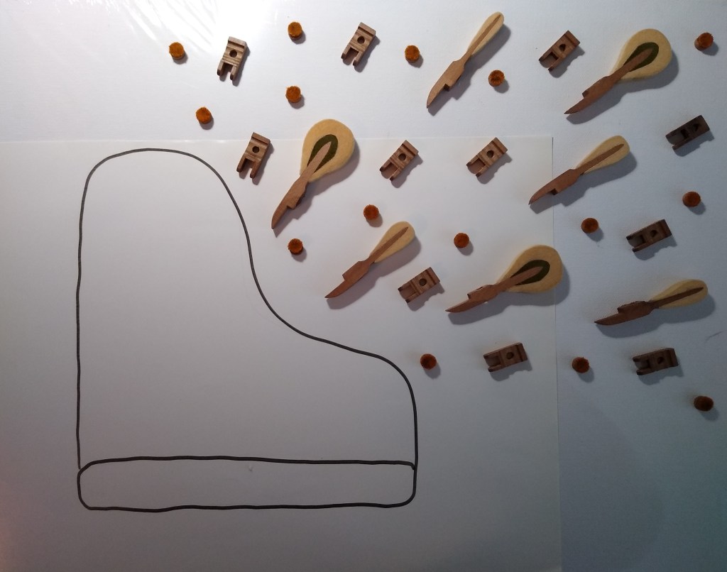
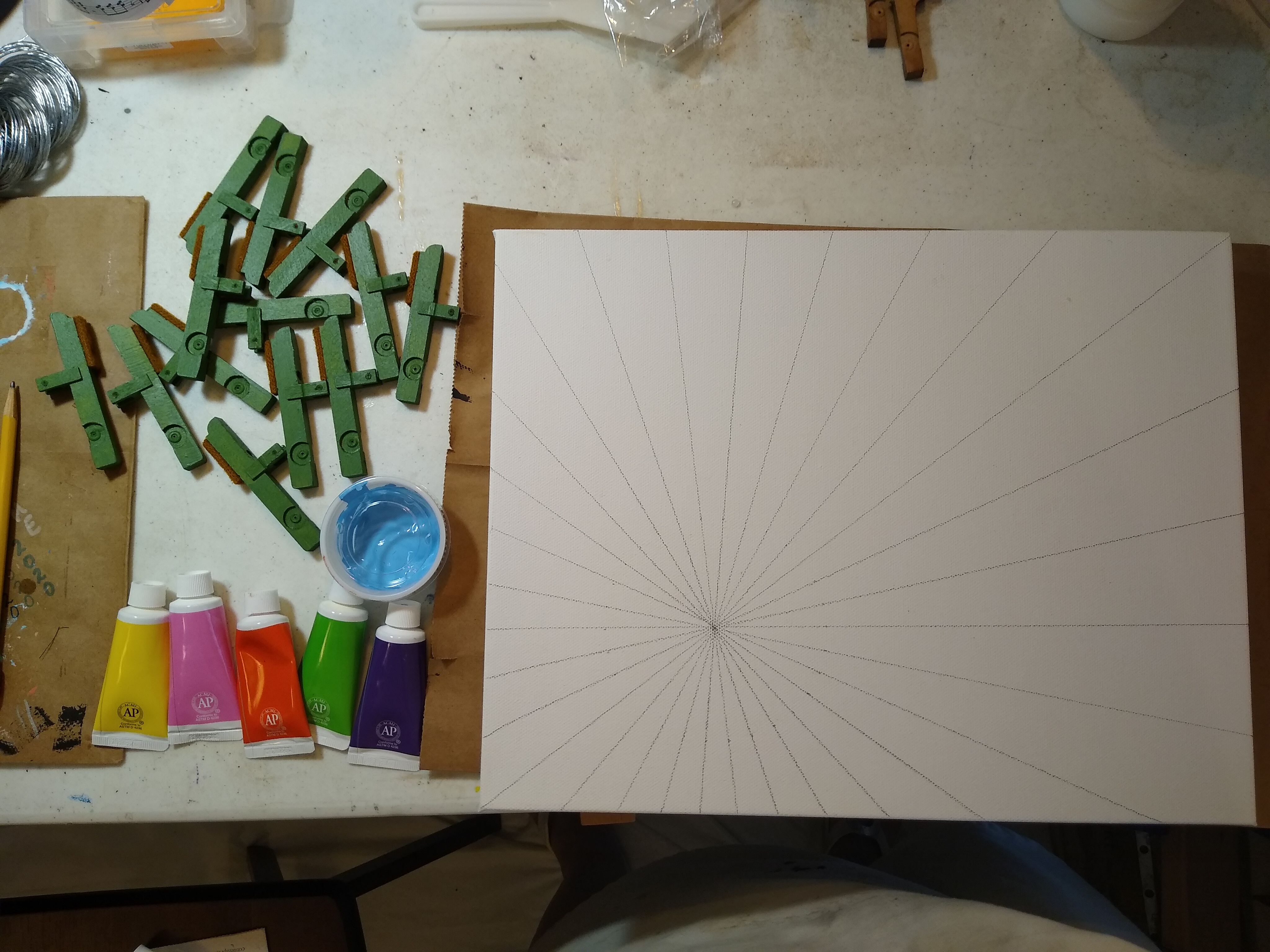
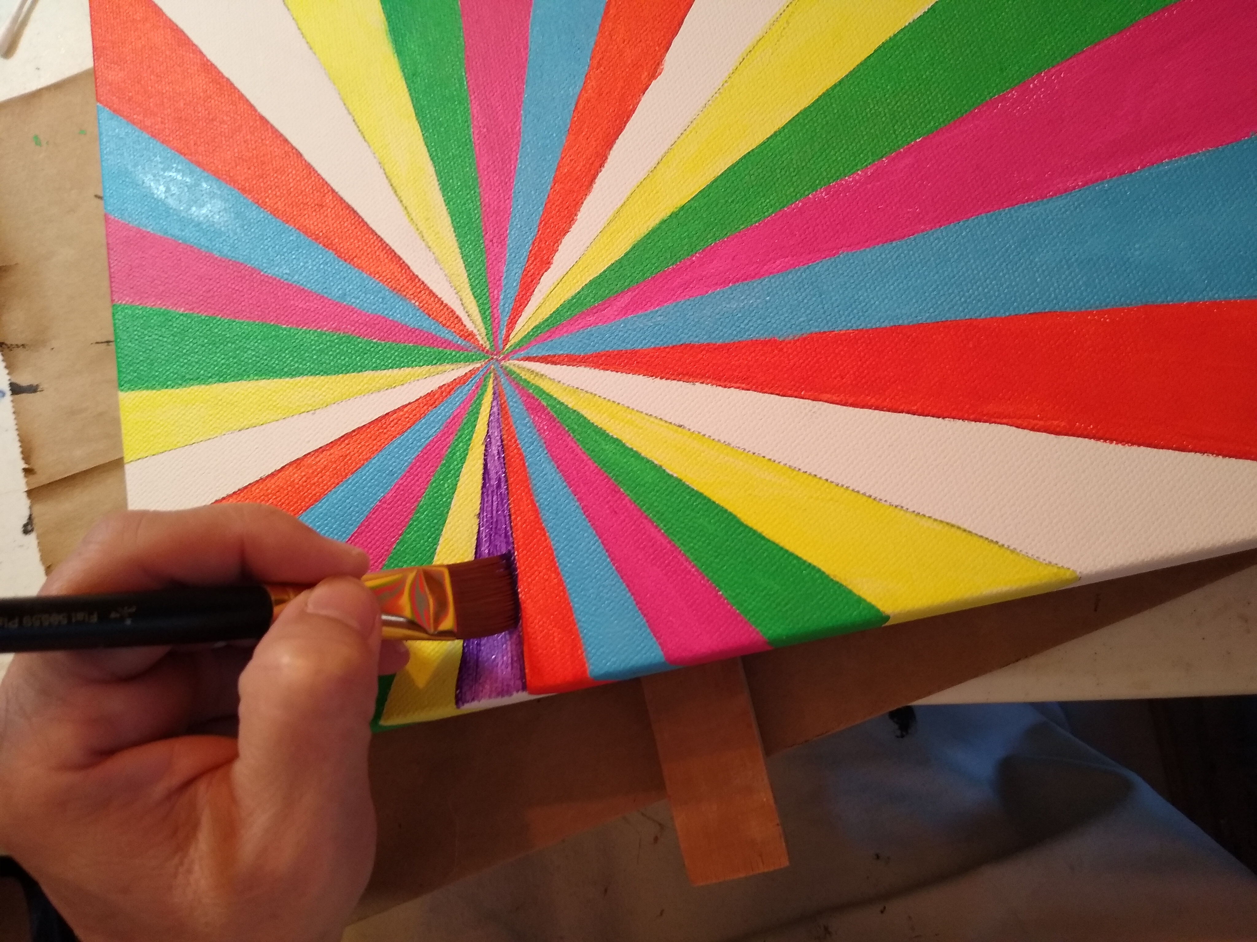
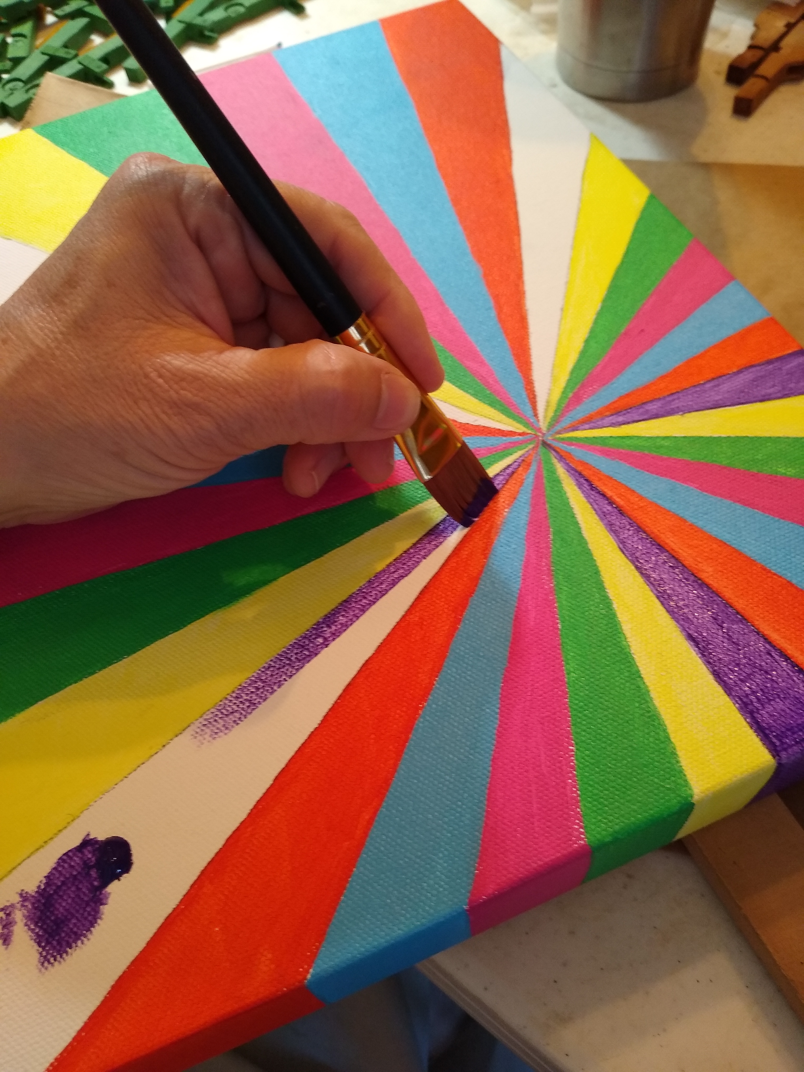
Not all wippens look alike, and only one piano has given me a set suitable as zombies. But if I put 13 zombies on each canvas (Yes, I chose that number deliberately.), I have enough for five paintings. In my Google search of 60’s colors, I also found five patterns I could use in the background. In that way, although I employ the same color scheme for each one, changing up the patterns will allow me to present five one-of-a-kind paintings.
It took four tries to get each color just exactly as I wanted it, neither too psychedelic nor too understated. I have no formal training in art, so mixing paints is more a matter of happenstance for me than science. But I learned a lot in the process, including how to judge what the color will look like when dry. My math skills were put to use in determining the angle for each ray and its placement on the canvas. I used a protractor and ruler to measure the angles and mark the lines; but when it came time to paint, I used only a three-quarter-inch flat brush and a steady hand. After all, this is a party, so I didn’t want it to look too sterile. At the same time, I had confidence that I could paint in straight lines well enough to make this look professional.

The first painting is complete, and that’s probably as far as I’m going to get for now. At this point I plan to release #2 in October 2021, and #3-5 will all be released in October 2022, in honor of the 60th anniversary of the hit song for which the painting is named.
“Monster Mash” #1 of 5 is currently available for sale on Etsy. Please check it out. I offer free domestic shipping on everything in the shop, and I’ll work with you for a fair price on international shipping.
Thank you for joining me on this tour of the studio. I look forward to seeing you on the next one. Until then, I invite you to check out photos of my other work in the gallery. Enjoy the rest of your day!

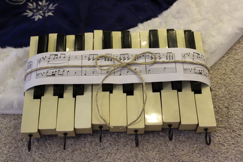
Welcome back to my piano art studio. Today’s tour features a piece known as “Keyed Up,” one of the longest-standing and most popular items in my inventory.
The first thing I ever made with piano keys was what I now call the small “Keyed Up,” a set of keys with their extensions cut off, leaving only the black and white parts we all recognize as piano keys. They were glued together in a staggered formation, rather than straight in a row, and I installed cup hooks on every other key. The first one utilized two full octaves, but I immediately reduced the length to 1½ octaves, not only to help me better meet the demand for this item, but also to make it more stable.

First, the keys have to come off the piano. This is usually easy, but not always. It depends on how the piano is assembled. I can generally figure out fairly quickly how to remove the music shelf, action, fallboard, and any other strips of wood that stand in my way of getting to the keys. However, one manufacturer in particular (Knabe) has me stumped on a rather old piano. I never was able to get the fallboard off because I couldn’t figure out how to access the screws upon which it pivots. But I needed the keys to fill an order, so I carefully maneuvered them up and off their pins then slid them out from under the fallboard.
As I remove the keys from the piano, and throughout the preparation process, I try to keep them in order. That is helpful, not only for creating the “Keyed Up,” but also other pieces in which I use keys together. They are always filthy dirty, so they get a bath in the sink with warm water and a special cleaning solution. I learned not to let them soak because soaking tends to loosen the glue that holds the ivories (whether genuine or not) and ebonies onto the extensions. Instead, I place them a few at a time into the water bath, scrub them on all surfaces with a grout/tile brush, then place them on wire racks to air dry. Drying time takes at least 24 hours, and preferably 2-3 days. Another hard lesson learned was that the “Keyed Up” can warp if there’s any moisture in the keys when it’s assembled. That happened to the set I made for myself. I haven’t received any negative feedback from others, so hopefully mine was the only one that messed up.


Once the pieces are thoroughly dry, if I’m making a small “Keyed Up,” I take the keys to my table saw and cut the extensions off. The extensions go into a bin for use in another project, and the cut ends of the keys get a careful sanding on the belt sander.
Using wood glue, I mount the keys to a piece of 1/4-in. lauan plywood. I purchase the plywood in 2′ x 4′ sheets and cut it down to roughly 6″ x 10″ and sand all edges. When the glue is applied and all the keys are in place, I then clamp it down very securely and leave it to set up for a few hours or overnight. Old extensions cut from other keys help me apply equal pressure to all the keys.

When the clamps come off, I drill pilot holes into every other key, then screw in the cup hooks. On the back I place a half-sheet story behind the art, including details about this particular piece, then add two sawtooth hangers across the top and two felt bumpers (felts from the piano) in each of the bottom corners.


From the beginning, I designed the “Keyed Up,” both large and small, as a place to hang your car/house keys—keys for keys, if you will. Then one day a lady purchased a “Keyed Up” at a craft fair and told me, “I’m going to use this to hang up my necklaces.” What a brilliant idea! Now I’ve done the same, as have several others.

The large “Keyed Up” includes the keys in their entirety—extensions and all. The term extension may be my own word, and it refers to the bare wood portion of the key that extends into the body of the piano and interacts with the action. On diagrams, I’ve never seen any other designation than simply key to represent the whole.
It didn’t take long for me to realize that not all keys are the same. For the most part, the dimensions of the visible portions of the keys (the ebonies and ivories) are standard, but the lengths and styles of the extensions vary greatly, depending upon not only the size of the piano but also on the manufacturer. When I used shorter keys, I had no trouble leaving the bare wood portion “blank.” But when I began creating large “Keyed Ups” using the longer keys of upright grands, I received feedback suggesting that I come up with a way to fill in the negative space.

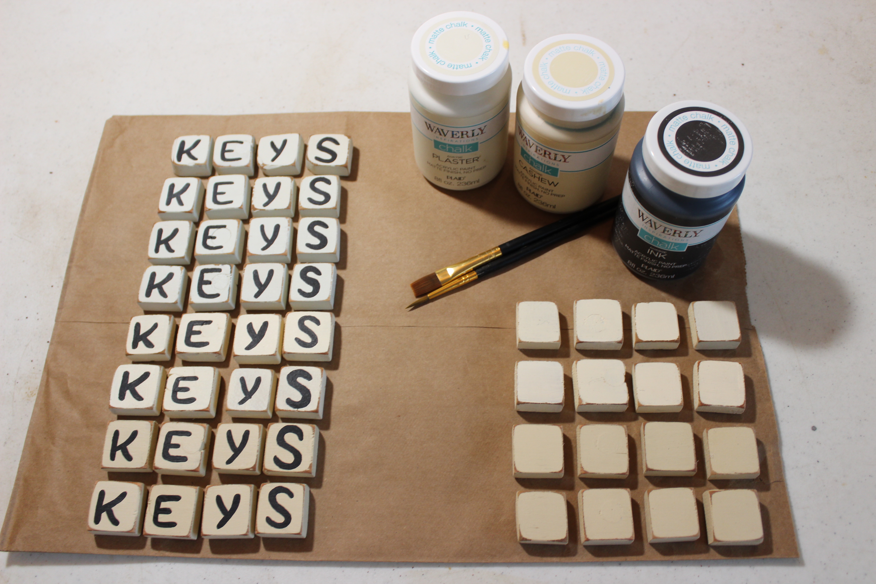


So I came up with an idea to fill in the space using a hammer from the piano and some hand-crafted lettered tiles (made from key extensions). I like it, but this isn’t for everyone. What if the buyer wants to hang something other than keys? Granted, “KEYS” could refer to the part of piano represented here, but maybe there’s something better—or at least different—that I can do.
Perhaps I could write a message across the key extensions. This seems like a good idea, but it’s been hard trying to decide exactly what to write on them. Should they all be different from one another? All the same? And if the same, what in the world do I choose?
Will you help me decide? If so, please complete the survey below. And if you like, you can go a step further by leaving me a comment with your own suggestion or feedback.
Thank you for joining me on this tour of the studio. I look forward to seeing you on the next one. Until then, I invite you to check out photos of my other work in the gallery. Enjoy the rest of your day!
Last year I moved my piano art from another website host to WordPress. The intention behind this shift was to make it easier to manage my online presence, as all three of my sites would then be in the same place. Well, it has been a learning experience, to say the least. Initially I ended up with a site that was merely a blog with a gallery page, when what I wanted was a gallery with a blog page. So today I explored my options and selected a new format that should prove much more pleasing to the eye and easier to navigate. It is still a work in progress, but it’s finally starting to become what I had envisioned.
The home page now features photographs of my piano art, with links to my Etsy shop for the convenience of you who would like to make a purchase. I haven’t finished uploading photos of my newest work just yet, but I promise they are coming.
Also, ever since the new year began, I’ve been trying to get back to writing Encore blog posts, but so far my schedule has not allowed it. The articles will come, in due time.
Below is my tentative itinerary for this year. It’s much more sparse than last year’s schedule, and I’m also staying closer to home. But all that is because I’m working on getting into a store! I can’t wait to tell you about it as the story unfolds…. Meanwhile, if you live in Northwest Florida, I looking forward to seeing you at my table at one of these venues:
3475 Pine Forest Rd., Cantonment, FL
Saturday, September 26, 9:00 a.m. – 3:00 p.m.
Destin Community Center, 101 Stahlman Ave., Destin, FL
Friday, February 17, 11:00 a.m. – 4:00 p.m.
Saturday, February 18, 9:00 a.m. – 3:00 p.m.
Destin Community Center, 101 Stahlman Ave., Destin, FL
Friday, November 20, 11:00 a.m. – 4:00 p.m.
Saturday, November 21, 9:00 a.m. – 3:00 p.m.
28 Miracle Strip Parkway, Fort Walton Beach, FL
Friday, November 6, 9:00 a.m. – 5:00 p.m.
Saturday, November 7, 9:00 a.m. – 3:00 p.m.
Riverwalk Park in Historic Downtown Milton, FL
Saturday, March 7, 10:00 a.m. – 5:00 p.m.
Sunday, March 8, 10:00 a.m. – 5:00 p.m.
Alyssa’s Antique Depot, Pace, FL
Saturday, April 11, 9:00 a.m. – 4:00 p.m.
Alyssa’s Antique Depot, Pace, FL
Saturday, May 9, 9:00 a.m. – 3:00 p.m.
140 W. Government St., Pensacola, FL
Saturday, May 2, 11:00 a.m. – 7:00 p.m.
Sunday, May 3, 1:00 p.m. – 6:00 p.m.
2800 Wilde Lake Blvd., Pensacola, FL
Saturday, November 14, 9:00 a.m. – 3:00 p.m.
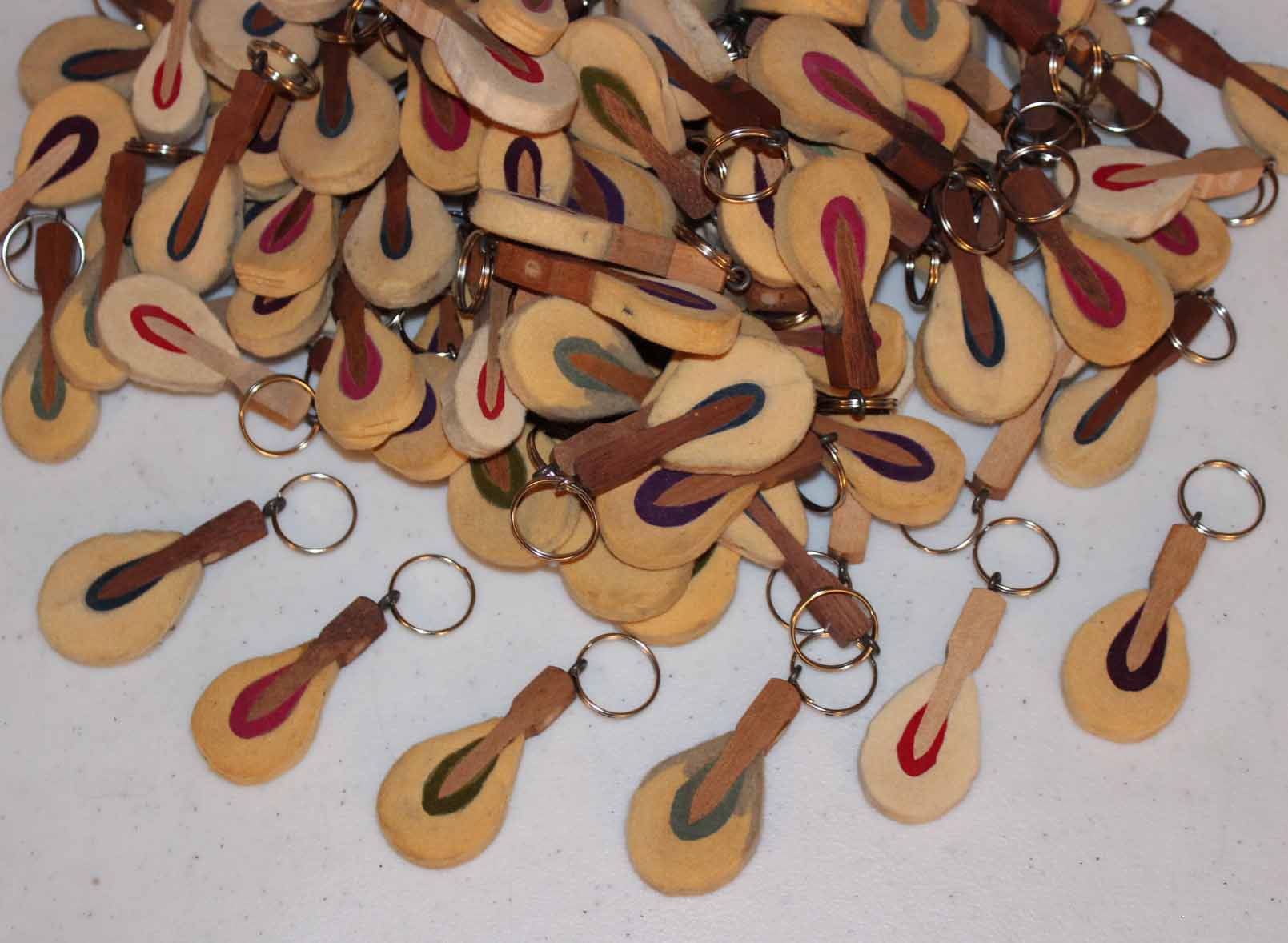
Most of my piano art creations have a music-themed name given to them. The key chains are one notable exception, for I have never called them anything but what they are. And that’s okay.
Welcome back to the Studio Tour. Today I’m going to share with you how to make key chains from piano hammers and ebony keys. The key chains are my most popular item, and I also use them as gifts for college graduates, personalizing them with their name and the year. In fact, personalization has become quite popular this year, with most online buyers requesting that a name or initials be written on the hammer. I have considered offering personalization at craft fairs. Perhaps this fall I will make it so.
The first set of key chains I made were constructed of piano hammers, an eyelet screw that also came out of the piano (technically called a letoff regulating screw), and a key ring. I bought a package of 100 key rings on eBay and set out to make 100 piano hammer key chains.
The process is tedious but fun, at least for me. I’ll share my process with you, and then you decide if you would also like to make piano hammer key chains.

")
")
")
")
")
")
")
")
")
So, what do you think? Are you ready to make a batch of piano hammer key chains? If not, feel free to shop in my store for one that I made for you.


")


There is another design I created, one that does not use the regulating screw. Instead, I drilled a hole through the hammer near the top, using a step drill bit with long tapers. This design came about when I tried making my second batch of 100 key chains, but the first five regulating screws broke when I had them screwed almost all the way into the hammer. I concluded that those screws were too degraded with rust to be useful. They didn’t appear rusty, but they had obviously been weakened by time and the elements.
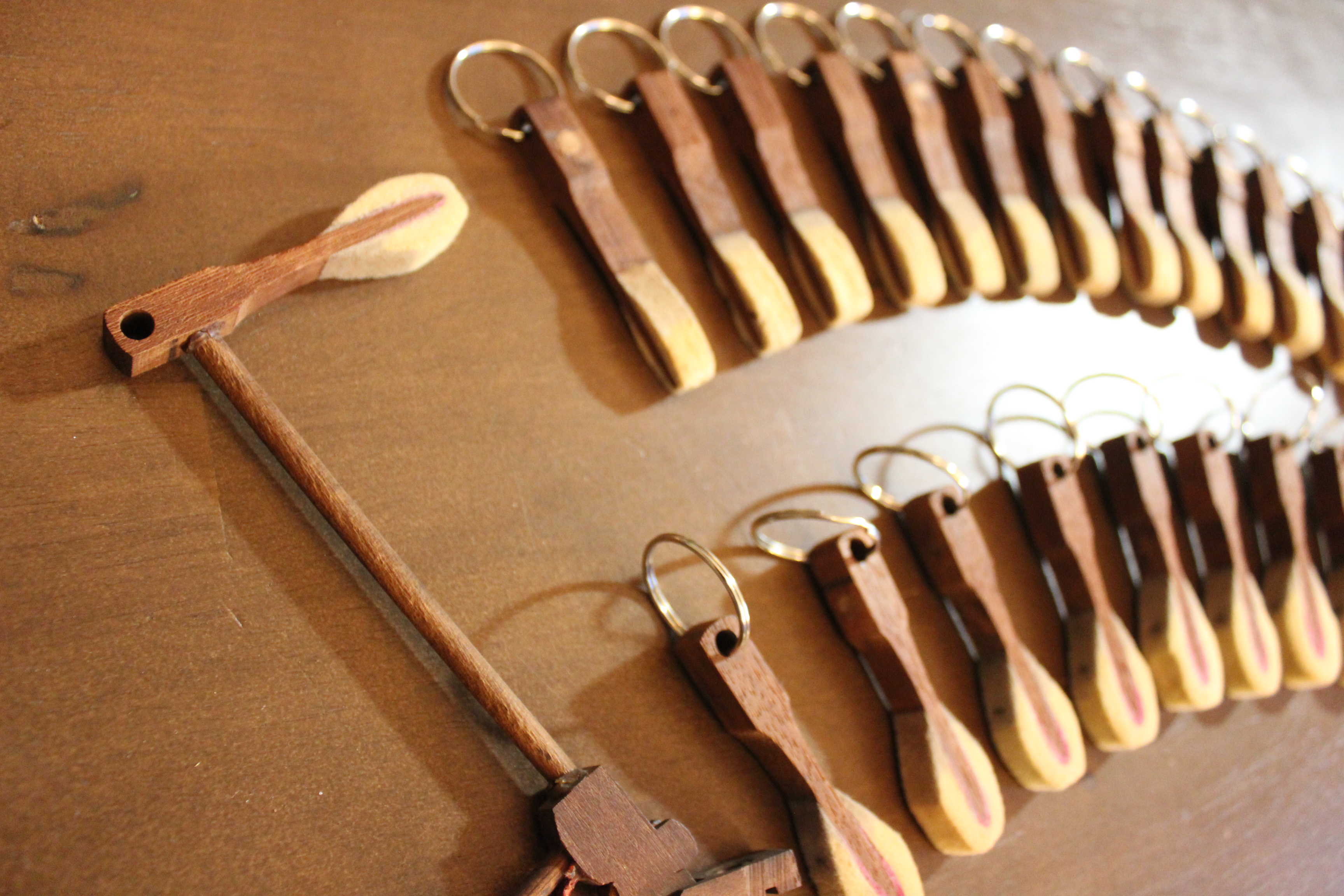
In one of the pianos, an 1866 Steinway upright, I discovered some 25 hammers that already had a hole drilled into them. It served no purpose that I could detect, but appeared to be part of the design. I took advantage of that pre-made hole to make more key chains. The hole goes from front to back rather than from side to side. This is inconvenient for the purpose of displaying the key chains on the peg hooks; but the design does enable the hammer to lie flat against your keys when you add actual keys to the ring.
However, I do prefer to use the regulating screw in the construction of my key chains, so I went back to eBay and purchased some brand new ones. That way I would know for sure that they were strong enough for the task. It increases my cost a little, but it also improves the quality of my product.
")
")
Next came ebony key chains. To date, I have not used regulating screws to make the ebony key chains, but only drill holes through the ebony and add the key ring. It sounds simple, but though there are fewer steps involved in making key chains from the ebonies, these steps can require more effort.
The ebonies are attached to key extensions, long pieces of wood (usually 12″-14″), by means of a special glue used specifically in the construction of pianos. The glue does degrade over time, and sometimes the ebonies pop off easily. Other times I soak them in a warm soapy sink bath, and am able to twist them apart. And sometimes I am powerless to separate them from the extension. Those ebonies are set aside for a different purpose.
I decided not to paint and buff the ebonies that show age, for the natural wear and tear of use has its own charm. I simply wash them, dry them, and polish them with a lint-free cloth and a touch of linseed oil.
Drilling the hole in the ebonies also takes more effort than drilling a hole in the hammer because ebony is a very hard wood. Yes, I have come across a few pianos that did not use genuine ebony for the sharps, but painted a softer, cheaper wood. Another technique is to cover the wood with black plastic. These are also cheaper and hold up better to use when the piano is being played. I save these sharps for other projects, and only use genuine ebony sharps to make my key chains.
Genuine ebony does not need to be painted because it is naturally brown-black in color. I have found some that were painted, and have removed the paint to allow the natural beauty of the wood to show through. They are quite stunning when they have been polished with the linseed oil, and the grains of the wood are visible!
Recently I made a new batch of key chains to sell at the Sand Dollar Cottage, a gift shop/art gallery in Navarre that carries some of my piano art. This was the first time I ventured to write on the felt parts of the hammers, and it turned out successfully. Again, I sealed the surface before writing, and most of the pen colors came out nice and crisp. I made some “ebony” key chains for this purpose as well. These are not genuine ebony, but are actually made of plastic, as they came off an old electronic organ rather than a piano. These key chains will be available very soon at the Sand Dollar Cottage.
")
")
")
")
If you happen to be in the area, do stop in and take a look around. The Sand Dollar Cottage is a co-op of about 50 local artists. Here you can find beautiful art, home décor, and souvenirs to take home to friends and family. Christmas ornaments are also sold year-round because folks tell me that they collect Christmas ornaments everywhere they go. The Sand Dollar Cottage is conveniently located in the Sand Dollar Plaza on Highway 87, northbound, just off Highway 98.
Thank you for joining me on this tour of the studio. I look forward to seeing you on the next one. Until then, I invite you to check out photos of my other work in the gallery. Enjoy the rest of your day!