From the Studio: Variations on a Theme

Welcome back to my piano art studio. Today I’d like to share with you a piece that may possibly be described as a “happy accident.”

The theme

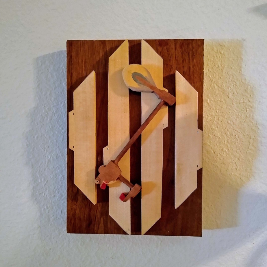
In a previous article I told you about “Middle C,” which is made using the keys C, D, and E, with the sharps between them, mounted to a piece of wood cut from the piano cabinet, and framed with the key extensions. This is the theme for what would turn out to be a variation.

When I make “Middle C,” I usually make them in batches of five or more. They sell quickly, so I like to have several on hand. I start by cutting the wood to the 7″ x 10″ pieces, then I sand each one until the edges are nice and smooth. Next, I select the key extensions that will form the frame around the edge of the wood, measure, mark, cut, and sand them. When that is done, I select the flanges and letoff buttons that I wish to use for these pieces and check to be sure their a good fit. Then, when all the pieces have been assembled, I take them outside to apply a spray varnish.

The variation

The key extensions are cut specifically for each individual piece of wood, since exact measurements may vary a little from one to the other. For that reason, I like to stack them together with the boards to which they were cut.

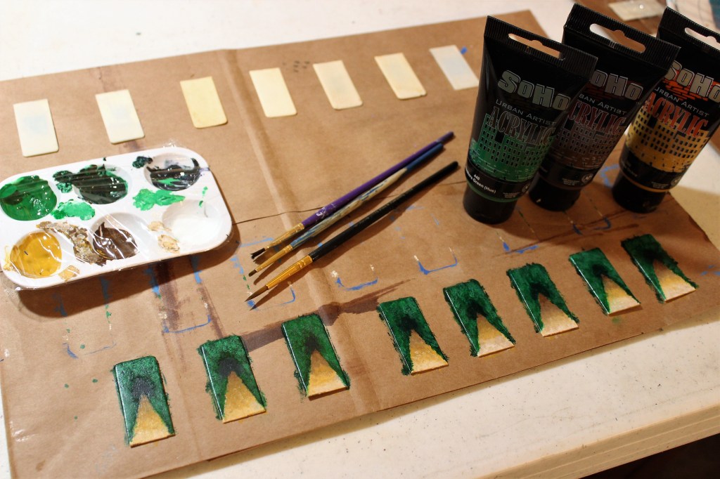
One day, while in the process of making a fresh batch of Middle C’s, a brand new idea came to me. To keep from them, I had arranged the key extensions in such a way on top of each panel that they formed a sort of diagonal, rather than leaving them along the edges. It struck me that this arrangement was actually quite beautiful and could stand on its own as unique design. Then, rather than using keys to complete the view, I placed a hammer across the whole.

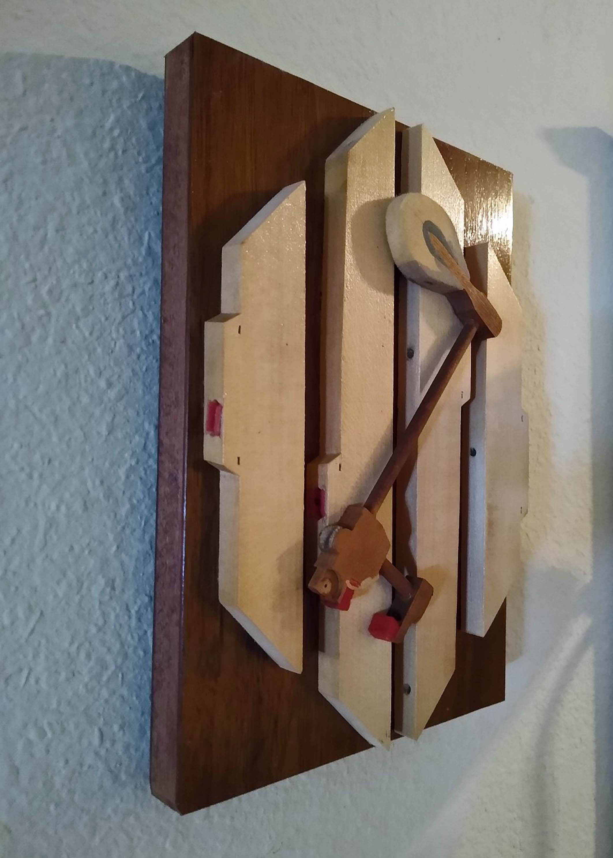
It wasn’t long before I realized that these too could be customized, by adding an ivory keytop tail in the space beside the hammer. This opens the door for a myriad of possibilities.

The name

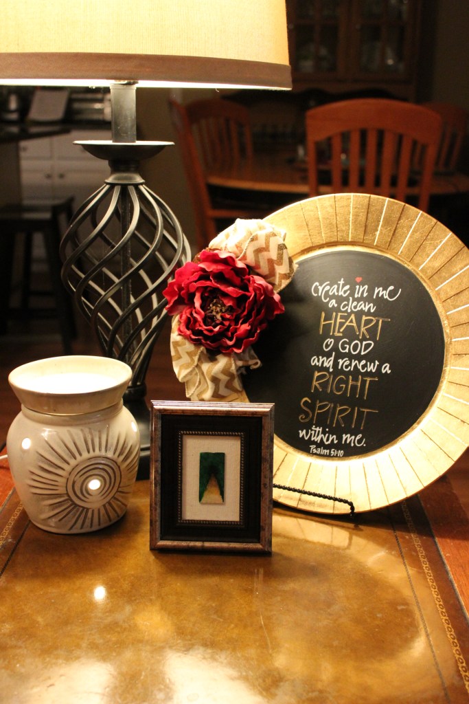
Since this design is a variation of that used to create “Middle C,” I decided to call it “Variations on a Theme.” In fact, I’m listening even now to Brahms’ Variations on a Theme of Paganini, Opus 35. In my mind, I see the name written on one of the many albums my mother had in her collection.

The finish

As with the “Middle C,” on the back I add a half-sheet “Story behind the art,” a sawtooth hanger, and two felt bumpers on the bottom corners (a.k.a. key rail punchings), and with that the piece is finished.

How can I make it mine?

Variations on a Theme” is available in my shop.

♬ ♬ ♬ ♬ ♬ ♬

Thank you for joining me on this tour of the studio. I look forward to seeing you on the next one. Until then, I invite you to check out photos of my other work in the gallery. Enjoy the rest of your day!

From the Studio: Middle C

Welcome back to my piano art studio. Today I’d like to share with you a piece that has come to mean a lot of things to a lot of people.

A new backdrop

Years ago I decided to create some pieces mounted on wood from the piano case rather than a stretched canvas. After all, I had lots of wood at my disposal. To begin with, I took a footboard (the panel at the bottom front of the piano, which conceals the strings and the workings for the pedals). I measured the board to see how it could be equally divided, and the result was a stack of smaller pieces measuring 7″ x 10″. I’ve used these measurements ever since.

Also in good supply, at the time, were keys I had taken from off the pianos. In particular, I had several sets of C, D, E, and the sharps between them.

The surplus was due to the fact that I had made quite a few pieces called “Keyed Up,” each of which incorporates two groupings of F-A and only one grouping of C-E. So I decided to showcase these small sets of keys by framing them in the extensions I had cut off of them.

A slight problem

What I didn’t realize was that piano keys are not a uniform thickness from one end to the other. Most of them appear to be, but when placed end to end, I could see the differences. That meant that could almost never have a clean corner on my frames. So I fixed the problem by adding embellishments to each corner, namely, a flange and a let-off button. They covered the imperfections nicely and added a bit of interest in the process. The felt on the letoff buttons can vary in color. In fact, I have found various hues of green, gold, red, and white. I usually incorporate the felts, to add a tiny splash of color; but sometimes I use letoff buttons that have lost their felts, and I think it looks good that way too.

A fitting name

Because this key display always incorporates and begins with the C note, I decided to call it “Middle C.”

A personal touch

The idea to turn “Middle C” into a commemorative plaque started with a custom order. The long-time organist at a particular church was getting ready to retire, and the congregation wanted to recognize his many years of service. Together my customer and I came up with a way to do this.

Since then, many other Middle C’s have been graced with a personal touch to commemorate an anniversary, retirement, or other special occasion.

To repair keys that had lost their ivories, I had purchased several recycled ivory keytop tails (the long skinny part of the ivory key) and heads (the shorter, fatter portion of the key). As it turns out, the tail fit perfectly on the bottom of the frame.

Since ivory is translucent, I paint the back with white so the wood won’t show through. And before adding the inscription, I trace the shape of the ivory tail onto a paper sack and practice writing in that space so I’ll know exactly how I want it laid out. When I’m satisfied with my draft, I then do it again on the ivory keytop tail. I first write in pencil, then go over it in ink. When the ink has dried, I seal it with two coats of varnish. Then when the varnish has cured, I glue it down to the frame.

Whether the “Middle C” is personalized or not, on the back I add a half-sheet “Story behind the art,” a sawtooth hanger, and two felt bumpers on the bottom corners (a.k.a. key rail punchings), and with that the piece is finished.

How can I make it mine?

It’s hard to keep these in stock, as they are one of my best sellers. But as long as I have one available for sale, you’ll find the “Middle C” here in my shop. When you get there, select the option that works best for you, whether standard or customized. Because of their popularity, I always keep this listing active, whether I have any completed Middle C’s in stock or not. When made to order, they usually take me a week to build; but if you find one in stock, you can have it in just a few days. In fact, I’m working on three of them right now: one to fill an order, and two more for you to choose from.

♬ ♬ ♬ ♬ ♬ ♬

Thank you for joining me on this tour of the studio. I look forward to seeing you on the next one. Until then, I invite you to check out photos of my other work in the gallery. Enjoy the rest of your day!

From the Studio: Ivory Illustrations

Welcome back to my piano art studio! I’d like to share with you the power of a friendly suggestion.

I believe you can do it.

One day a couple years ago my friend Adele approached me at church with a piece of piano art someone had given her. The scene was of a country road winding through the woods and beyond a small cottage—all this painted on an ivory keytop head, which measures less than 1 inch by 2 inches. I was amazed at the detail that could be captured in such a tiny painting. The setting was equally stunning, as the painted keytop was set on a background of black velvet and enclosed in a 2½” x 3½” frame. “I believe you can do this too,” she said.

Challenge accepted

I’d never painted anything so small before, but I rose to the challenge. At home, I got out a sheet of canvas paper, traced several times around an ivory keytop head, then set about to paint a variety of settings within the constraints of my small rectangles. I wanted them to be my own, not a copy of the one my friend had shown me. Each setting was from a place I had been. Several were from photographs I’d taken, but a few came from my memory.

When I had painted seven scenes, I chose four of them to duplicate onto the actual ivories. I decided to create eight copies of each of scene, so I fastened 32 keytop heads to a paper sack with a small piece of rolled painter’s tape under each one.

Right away I learned that painting on the smooth ivory surface is much different from painting on the canvas paper. It took layer upon layer of paint before the picture began to emerge. (Now I prep the keytop head with a coat of sealer before painting, as it gives me a better surface on which to apply the paint.) Then using my smallest (liner) brushes, I set out to create what I hoped would be masterpieces—or at least identifiable scenes from nature.

Putting them together

When the paintings were complete, I borrowed from the other artist’s idea of mounting the keytop head onto a piece of black velvet in a small frame. This size frame is easy to find, but finding one that doesn’t look cheap can be a challenge. I cut the fabric down to size and mounted it to a piece of sturdy cardboard, also cut to size. The glass that had come with the frame was set aside for a possible future use.

A reason for rhyme

In addition to painting canvases and repurposing pianos, I also enjoy writing poetry. That said, I decided to write a short poem to go along with each painting. Three of them came out five lines long, which stands in perfect proportion to the keytop head. But for my favorite scene, the Blue Angels and Pensacola Lighthouse, I wanted something different. I had recently been to a show, and my mind was still filled with national pride in the skill and strength of our military. No, this one needed more than five lines of poetry! So instead, I wrote a shape poem in the form of a jet with its gray/white streaming contrail. Then with a bit of trial and error, I came up with a suitable display of both the poem and its accompanying miniature painting. To frame it, the Ocracoke design by Better Homes & Gardens, which looks like shiplap, was perfect. (Note, this style has apparently changed ownership. It’s now carried at Walmart under the Mainstays brand and in other stores under the name of Philip Whitney.) I also added a flourish of shells collected off the Pensacola Beach.

With the exception of “Angels and Light,” my original designs that included poetry were framed as 5×7’s and mounted to either black velvet or unbleached canvas. I printed the poem onto cardstock and layered scrapbooking papers underneath. There was a flaw in this design, however. By taking these items to craft fairs, I learned that they don’t hold up well under the Florida humidity. I tried several different adhesives, and the only one that worked was fabric glue, which is messy to work with. But I’m constantly watching YouTube videos to see how other crafters work, and I’ve learned a new technique that will greatly improve my design. I look forward to implementing the new ideas in the coming weeks and months. And of course, I’ll share them here when they’re finished.

Making it personal

To date my skipped-over scene ideas remain unused. One of these days I’ll get to them.

But I have painted other settings on ivory keytop heads by commission. My favorite was a recent commission for which I painted a Denver skyline. This was my first mini painting done in landscape mode. It kind of scared me, to be honest, because I had to make it recognizable as the city of Denver, not just a random city with a backdrop of mountains. Evidently I did well, for my customer was pleased. I’m always happy to oblige, and I’m honored whenever anyone asks for a custom piece.

How can I make it mine?

Only a few of my original Ivory Illustrations remain: two small “Black River, White Sand,” and three large “Angels and Light.” As I paint more—and update the ones that include poetry—I’ll also add these to my shop.

If you have an idea for something you’d like special, by all means, let me know. After all, it was a suggestion from a friend that brought Ivory Illustrations to light in the first place!

♬ ♬ ♬ ♬ ♬ ♬

Thank you for joining me on this tour of the studio. I look forward to seeing you on the next one. Until then, I invite you to check out photos of my other work in the gallery. Enjoy the rest of your day!

From the Studio: Coming Home to You


Christmas was approaching, and we put our names in the hat for the gift exchange. I drew my brother-in-law’s name, but had no idea what to get for him. He is a cross-country truck driver, home only on the weekends. I’m an artist, specializing in things made from piano parts. I decided to make something for him from the materials at hand that he could carry with him in the truck.

First, I went to social media and downloaded a nice photo of my sister, and cropped it to 5×7. Then I went out to the garage, to my supply of piano wood, and taking the footboard from the 1915 Kohler & Campbell upright piano, cut two pieces from it, trimmed to approximately 6×8, and sanded the edges nice and smooth.

The veneer was loose on one side of the wood, so I removed it completely on that side, then stained the cut edges of the wood and the exposed wood where the veneer had been removed, and set it aside to dry while I worked on the photos.

The original photo I kept pretty much as it was, with the exception that I applied a sepia filter to it in Photoshop. Then I copied and reversed it on the vertical axis, forming a mirror image of the original. I then made the reversed image transparent (like a watermark) and added over the top of it the words, “Happiness is having someone to come home to.” I ordered the prints through Sam’s Club and picked them up an hour later.

Back home, I used a spray adhesive to apply the photos to the inside panels of the wood, then let them sit several hours to dry. The next day I attached the two pieces of wood with two store-bought hinges and applied two coats of a clear polyurethane varnish to all surfaces, allowing time to dry between coats. Finally, I let it rest a few more days to cure.

When Christmas came, I was a bit apprehensive, wondering if Richard would like his gift. I didn’t need to worry—he loved it!

I can make one for you as well. Simply send me a photo and payment, and I will do the rest. The finished product may look slightly different from what you see in the photos here, depending on which piano gives you its wood, but the end result will be a unique and beautiful keepsake—made from the wood of an old piano—that you and your loved one will treasure for years to come.

Happiness is coming home to you!

From the Studio: Piano Headboard

headboard made from an old piano
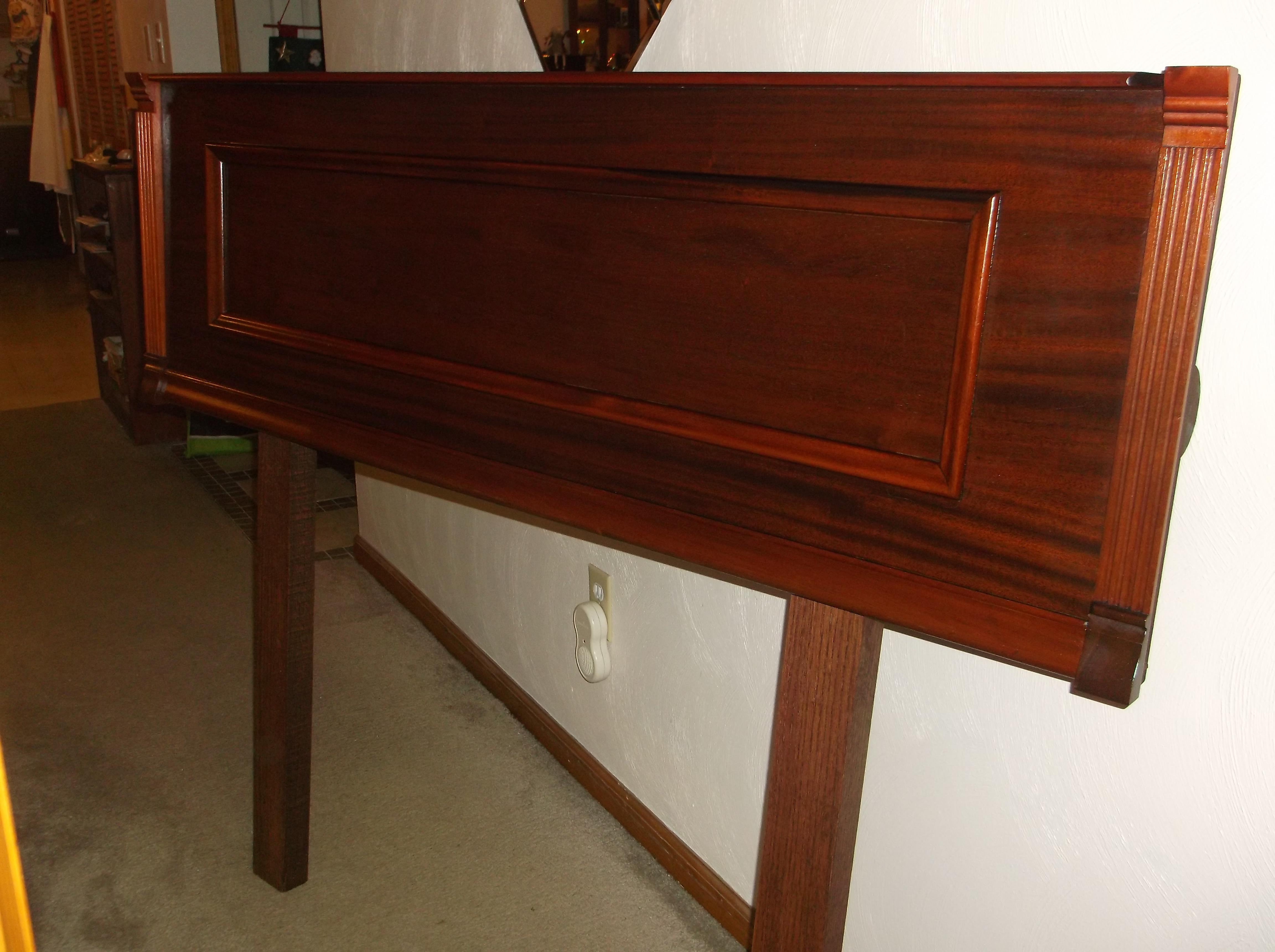
It’s always exciting when someone asks for a custom order. Such was the case with the headboard. I had made a mirrored coat rack from the music shelf of the Lyon & Healy piano and took it with me to a craft fair. A lady saw it, and it gave her an idea for something special she could do for her mother, who was a retired piano teacher. Her mother lived with her in her home, and she slept in a hospital bed to aid in her comfort. But the bed did not have a headboard. So the lady visiting my craft fair booth wondered if I could make a headboard from a piano music shelf. I told her I would try.

At home I looked at the other pieces I had from other pianos. Most of them were in poor condition, and I was inexperienced at that sort of restoration. So I began to shop around, mostly looking at the local listings on Craigslist. Pretty soon I found a piano near me at a price that I could afford, and I purchased it. So it was that I came across this beautiful Royal Cabinet Grand. Incidentally, this is also when I learned that the tallest of the upriRoyal Cabinet Grand (1)ght pianos are actually grand pianos built vertically—hence the term “upright grand.” I call this one a cabinet grand because that is the name so designated on the piano.

My sons helped me get it home, and I went to work right away to build the headboard.

The first question to determine was how long the headboard should be. It was going to be longer than the bed was wide, no question about it. I removed the music shelf and the side pedestals from the piano, laid them out on the floor of my studio, then took pictures of them to send to my customer to show her what I had found. I also wanted her opinion as to whether to include the pedestals as part of the headboard. They would add visual interest, but they would also add width to an already too-wide headboard. She liked the look, however, so the pedestals stayed.

piano music shelf to become a headboard

As with the coat rack I had built from the other piano, I flipped the music shelf upside down so the actual shelf would be up top.

On the piano, the music shelf had been hinged near the center, and the pedestal had been attached to the cabinet. In order to attach the pedestals to the shelf, I used key extensions on the back, which were secured with screws (from the piano action) and wood glue.

The headboard was not going to be attached to the bed, but was only going to lean against the wall behind it. Since the headboard had a gorgeous red mahogany finish, I went to the local hardware store to purchase a length of mahogany 2×4 wood to make the legs. They would be hidden by the bed, but just the same, I wanted them to suit the headboard. With a coat of stain for the legs and the key extensions on the back, everything was beginning to look quite nice. I attached the legs with antiqued brackets, and moved on to the finishing touches.

The next step was to conceal all the minor scratches and flaws. Then taking some green felt that I had removed from the piano and cleaned, I applied it to the places where the headboard would rest against the wall, to prevent any marks on the same. We bought a set of sliders to go under the legs, and the headboard was finished and ready for delivery.

This slideshow requires JavaScript.

It was a happy day when I got to meet the lady who would enjoy this piano headboard. I put it in her room, and listened with delight to some of her stories of her glory days as a pianist and teacher. My friends, that’s what piano art is all about.