From the Studio: Attracted to Music

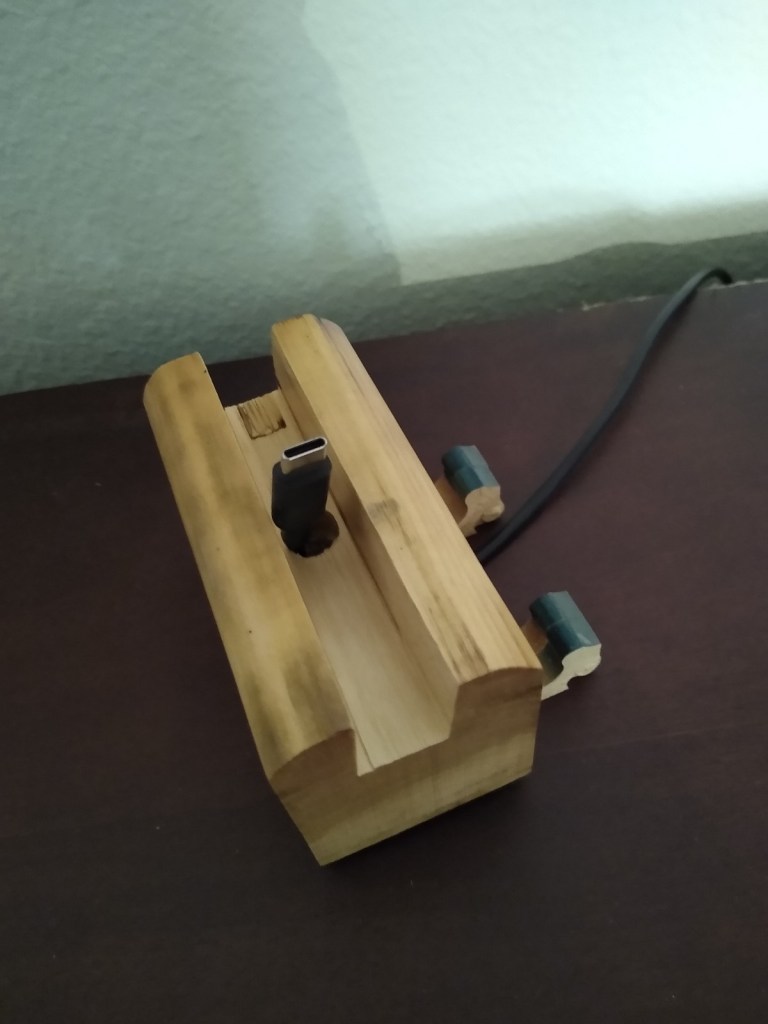
Welcome back to my piano art studio. Today I’d like to share with you something simple yet practical.

Hundreds upon hundreds

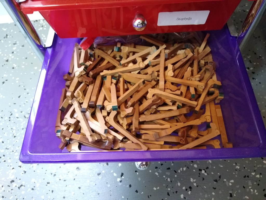
Every piano has 88 keys, right? And every key has its own corresponding hammer. And I have disassembled 25 pianos to date. Excuse me a moment while I do the math…. Yes, that equals 2,200 hammers that have passed through my hands.

But wait… there’s more! A few technicians have given me old parts by the boxful. Add to that the hammers I’ve purchased to meet some special need, and the number above could easily be doubled. No matter how you look at them, that’s a lot of hammers!

What to do with them

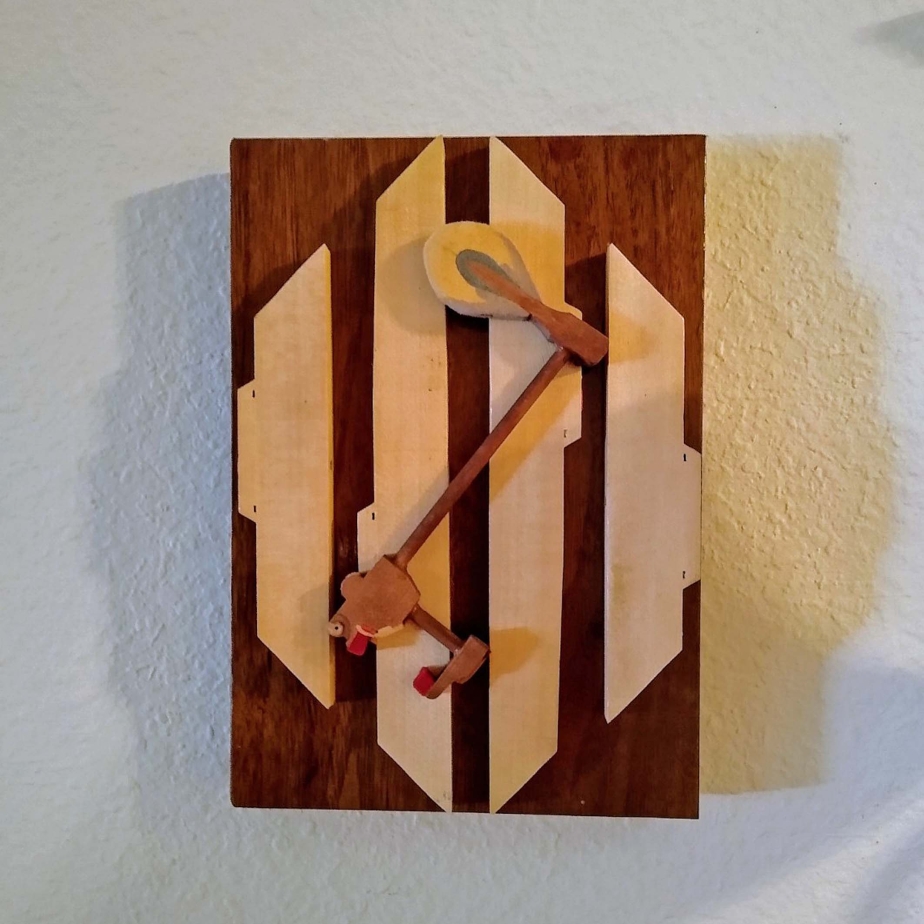
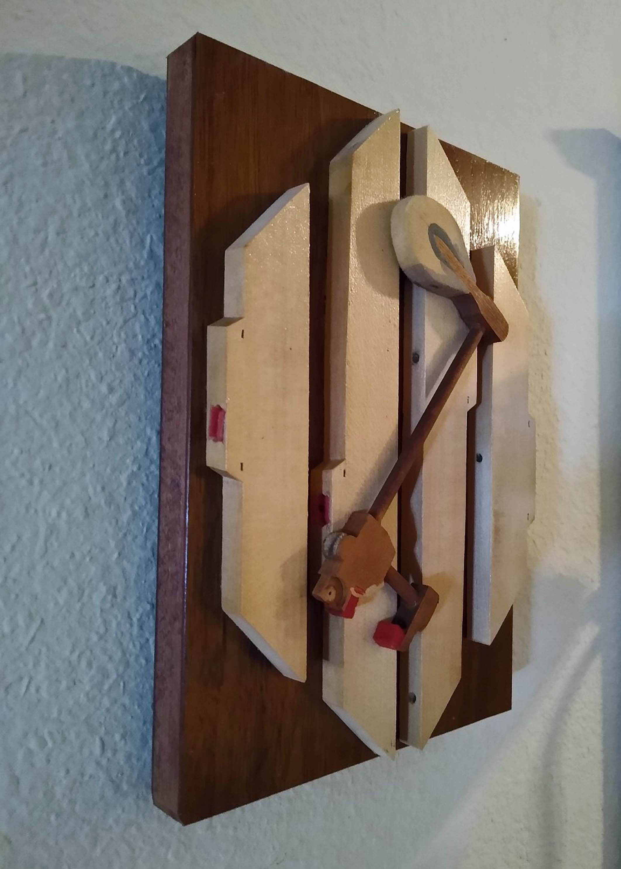
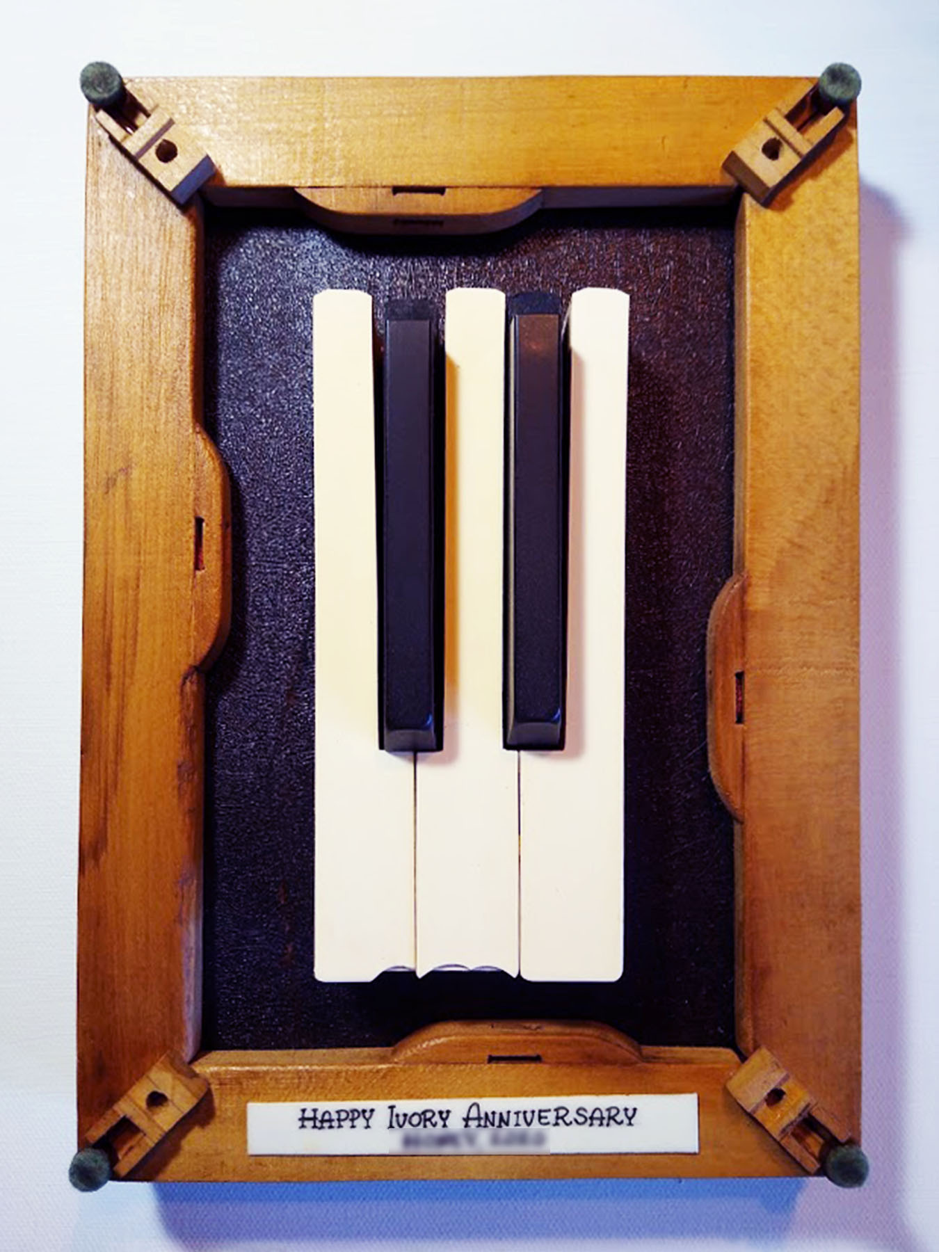
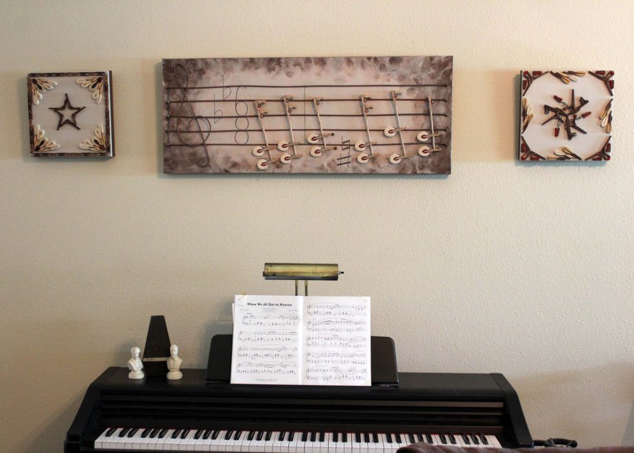
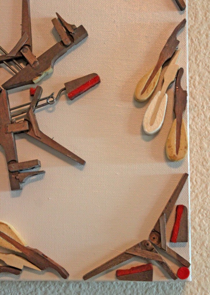
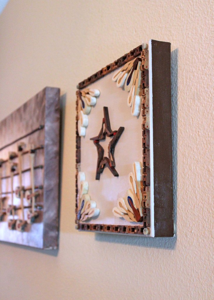
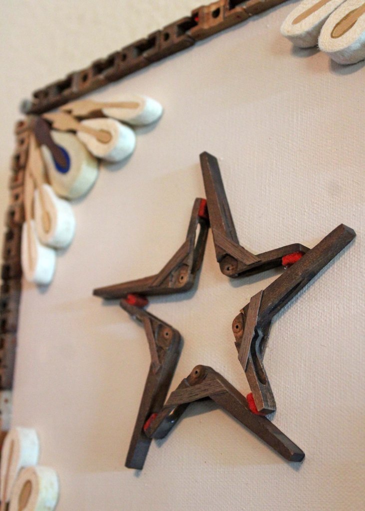
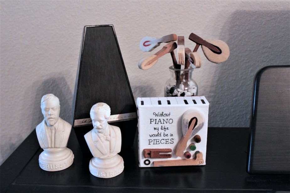
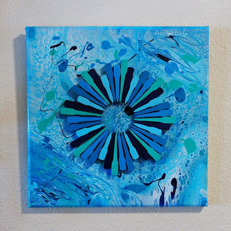
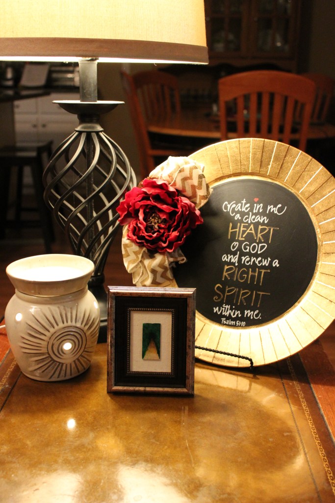
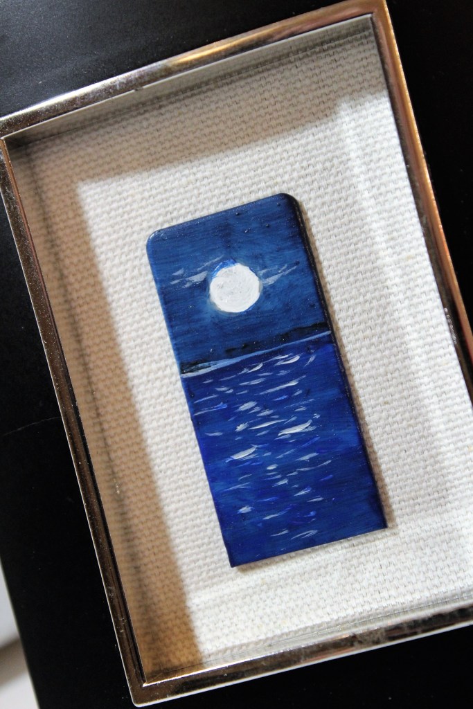
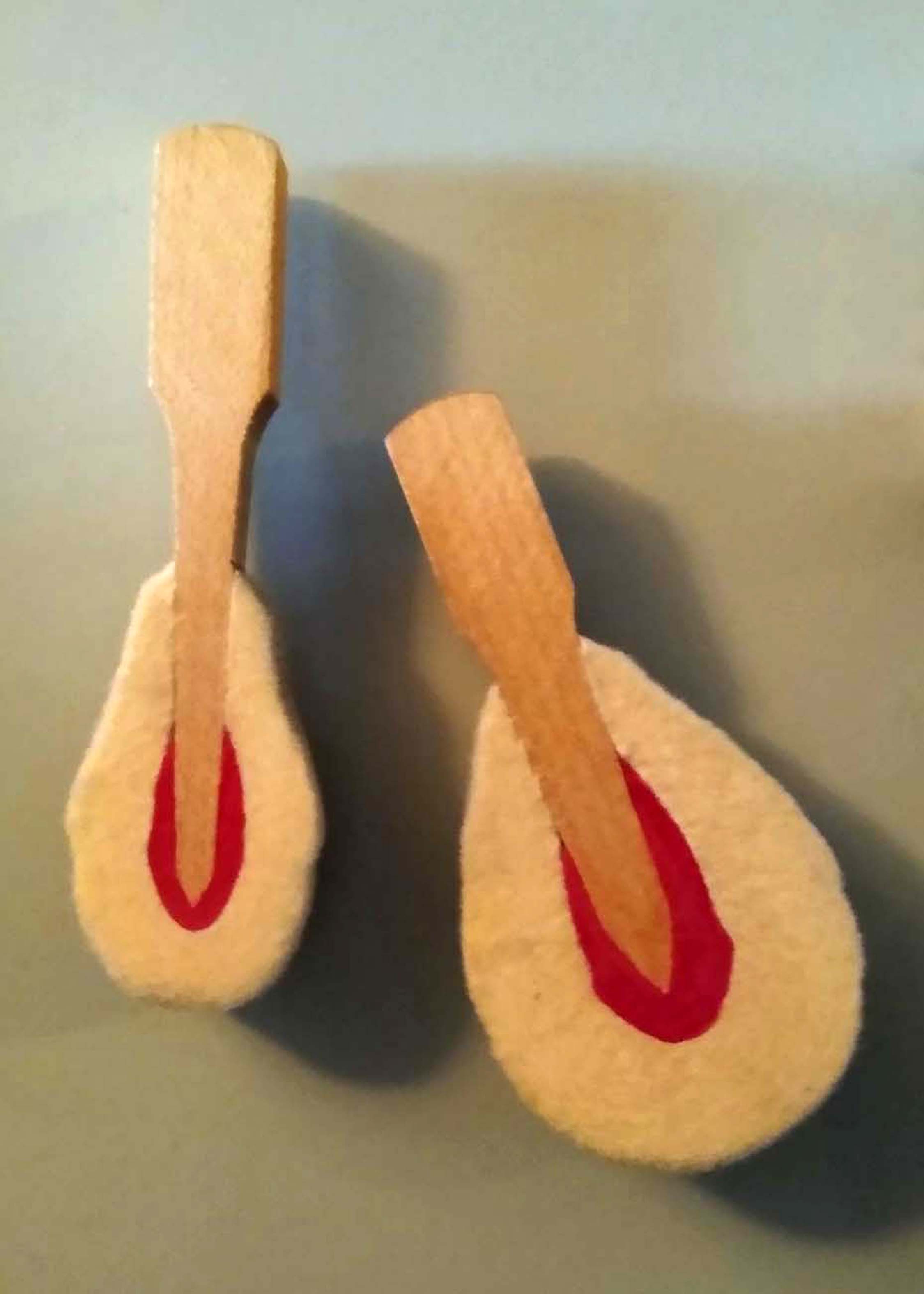
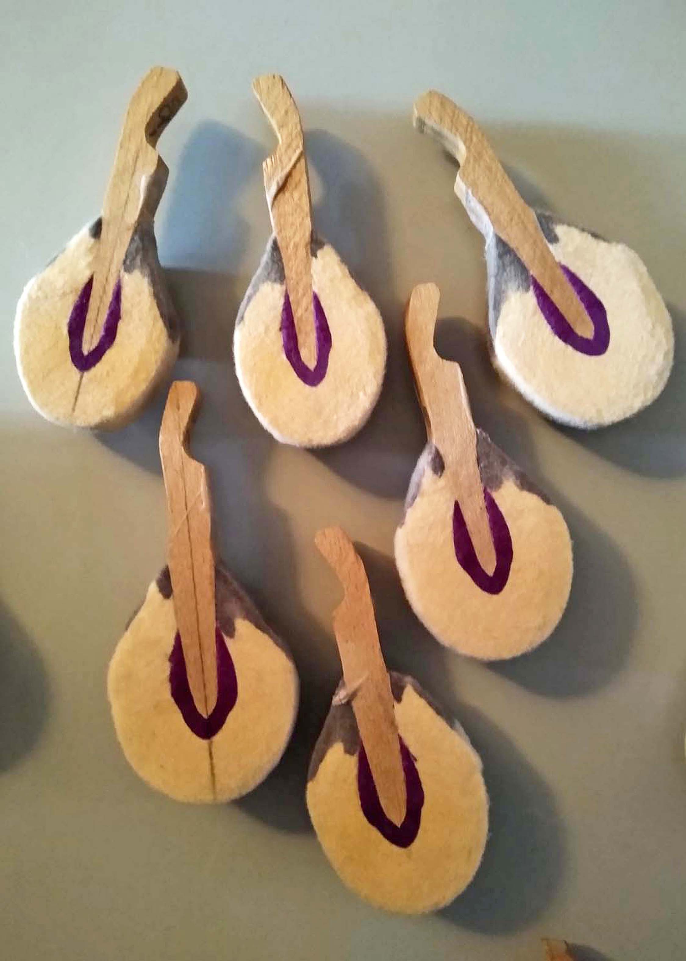
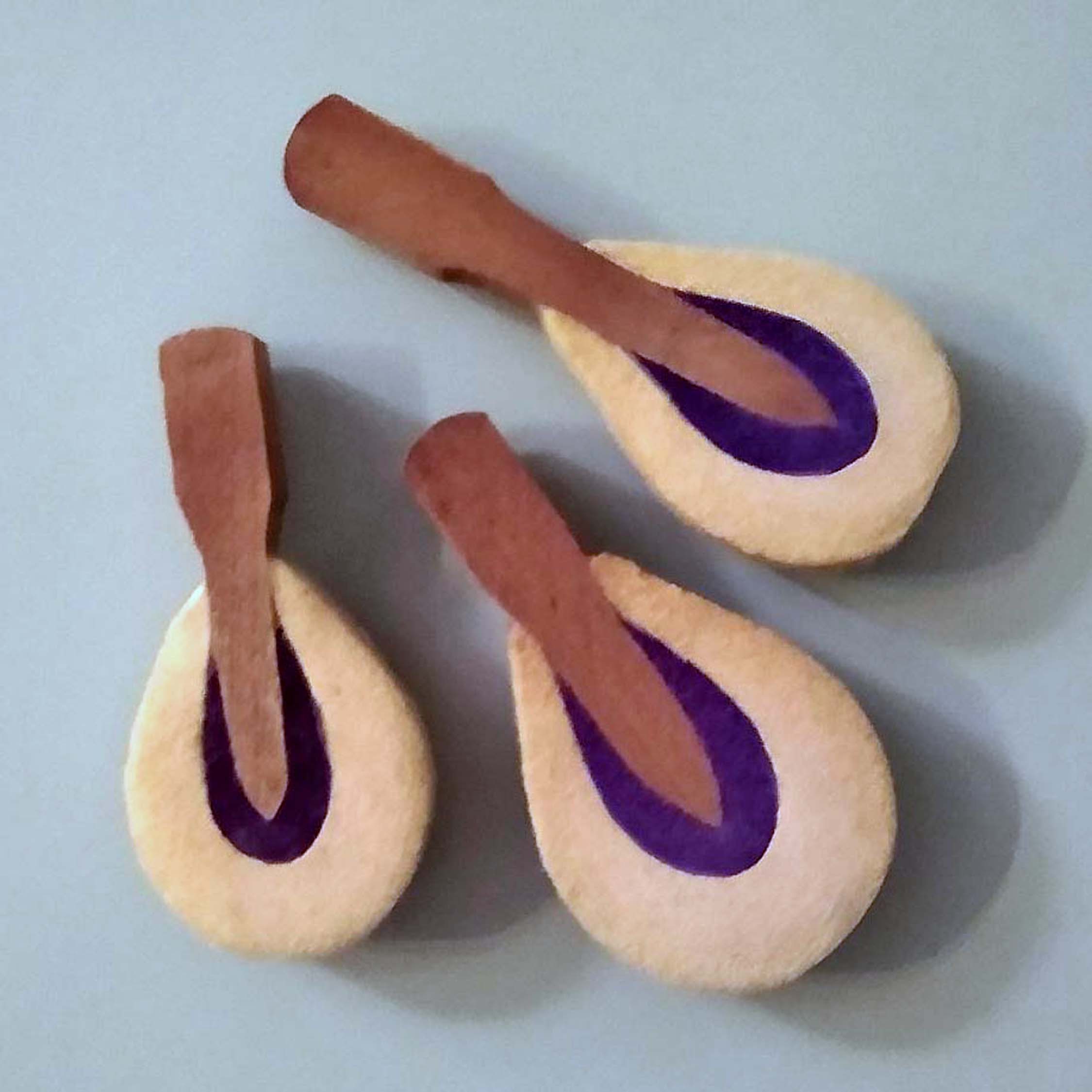
Hammers have appeared in a good many of the mixed media art pieces I’ve created, as well as several of the home decor items. The reason for this is that they are easily recognizable as coming from a piano. Not everyone knows their proper name, but pretty much all know how they are used in a piano: to strike the strings and start the vibration that makes music.

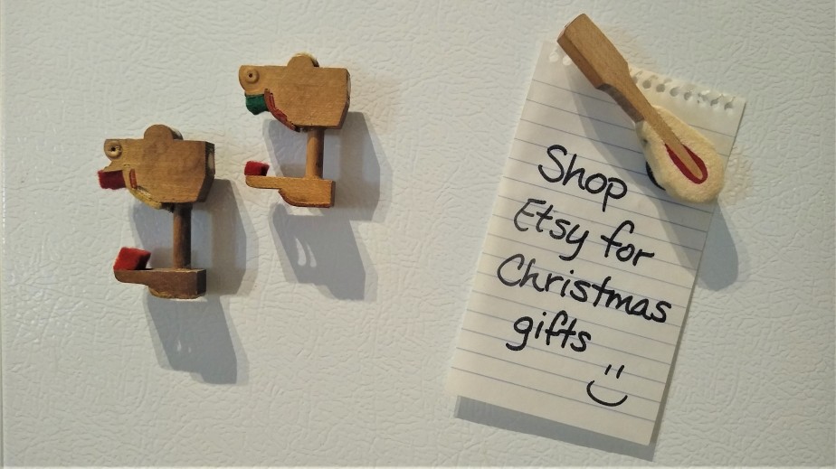
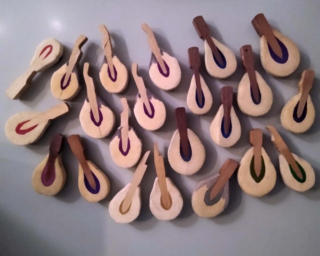
Apart from key chains, of which I’ve made more than 1,000 to date, I’ve really found myself attracted to the idea of making magnets. Okay, that was corny, I admit. But you would’ve said it too.

The process

As simple as magnets appear to be, they do take a bit of time to put together.

  1. Separate the bridle strap from the bridle wire.
  2. Unscrew the hammer from the action assembly.
  3. Remove the bridle strap from the hammer with a box cutter.
  4. Scrub the entire hammer thoroughly with a wire bristle brush to remove dirt and dust.
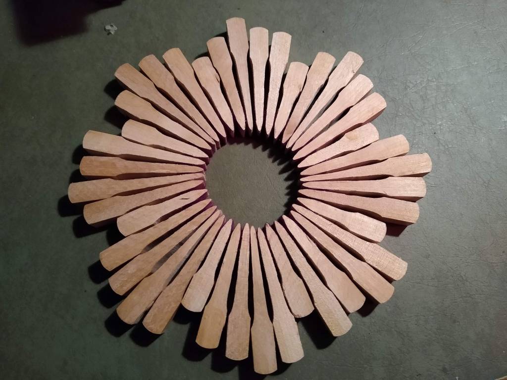
  5. Cut the head away from the shank. (And while I’m at it, also cut the butt [i.e. “chicken”] from the other end of the shank.)
  6. Sand all cut edges.
  7. Set aside the largest hammers to be made into magnets; store all the remaining pieces to be used later in other crafts.
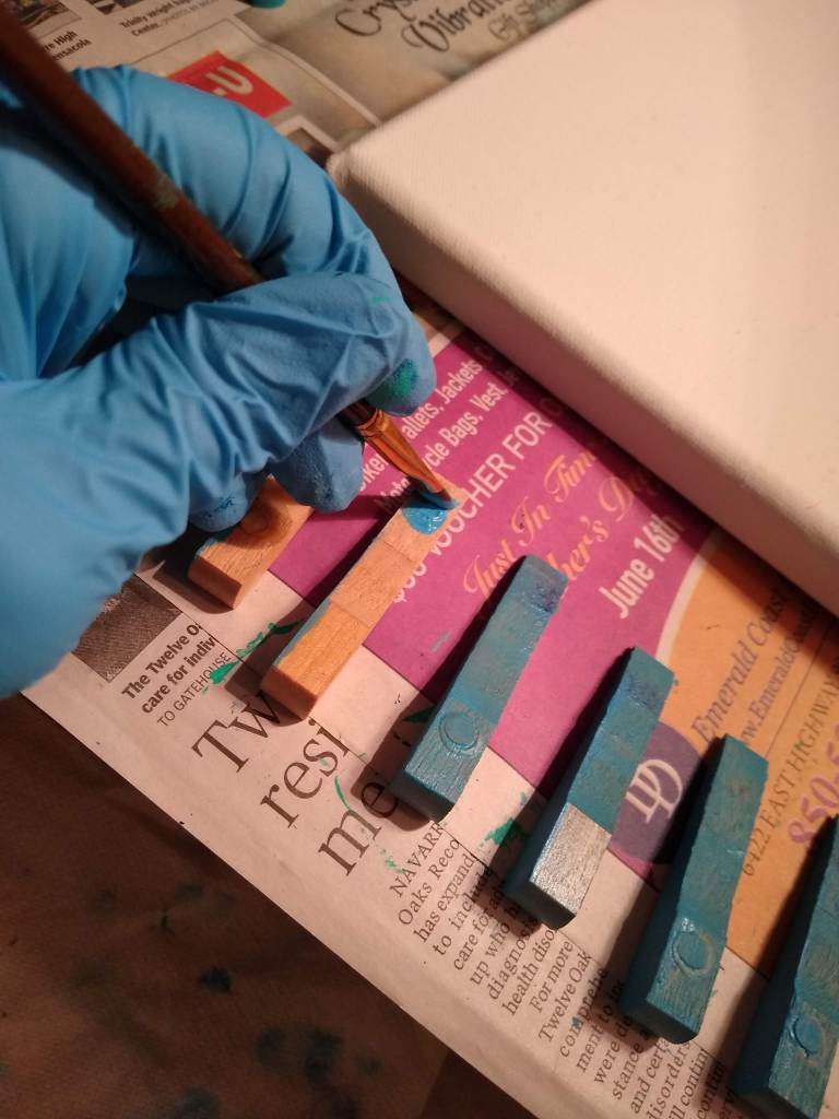
  8. Choose the more attractive side of the hammer head and use E-6000 adhesive to glue the magnet button to the opposite side.
  9. Clamp magnet and hammer head for good adhesion; let the adhesive set.
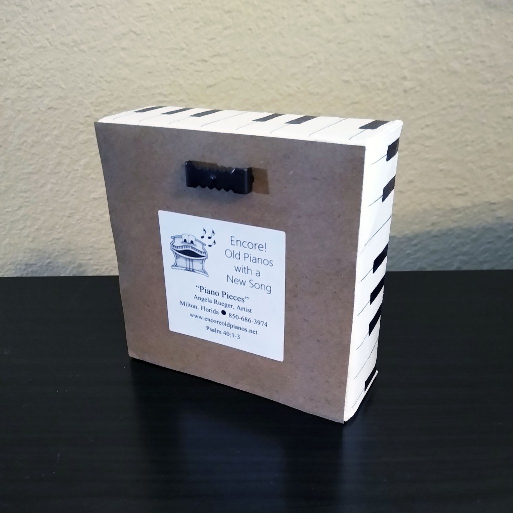
  10. Print out the half-sheet “Story Behind the Art” for hammer magnets.
  11. Fold the half sheet to fit both it and the magnet into a small zippered pouch.
  12. Add personalization whenever requested. Sometimes I practice first on another hammer head, particularly if I think it’ll be hard to fit the phrase or name in the available space.

How to use them

The button magnets I utilize are nice and strong, making these devices useful for holding whatever you wish to display, whether it’s tickets to the next ball game, a photo of your loved one, or your kindergartner’s artwork. Use them on any magnetic surface:

  • refrigerator
  • locker
  • file cabinet
  • mirror
  • dry erase board

Hammer magnets can also serve as keepsakes or mementos when you ask me to write names and dates on them. A piano teacher could give a magnet to each of her students, personalized with the date of their piano recital, which the student could then use in their locker at school. It’s a thoughtful and affordable gift on any teacher’s budget.

And this gift idea works well in the other direction too—from the student to the teacher. What mentor wouldn’t be thrilled with a magnet she can proudly display that bears her name and the phrase “#1 Piano Teacher”?

How can I make it mine?

The hammer magnets are available in my shop to purchase individually or in sets of eight. Personalization is optional, but it is free if you choose to do so. I know you feel drawn to go check them out, so I’ll see you soon at Etsy!

♬ ♬ ♬ ♬ ♬ ♬

Thank you for joining me on this tour of the studio. I look forward to seeing you on the next one. Until then, I invite you to check out photos of my other work in the gallery. Enjoy the rest of your day!

From the Studio: Variations on a Theme

Welcome back to my piano art studio. Today I’d like to share with you a piece that may possibly be described as a “happy accident.”

The theme

In a previous article I told you about “Middle C,” which is made using the keys C, D, and E, with the sharps between them, mounted to a piece of wood cut from the piano cabinet, and framed with the key extensions. This is the theme for what would turn out to be a variation.

When I make “Middle C,” I usually make them in batches of five or more. They sell quickly, so I like to have several on hand. I start by cutting the wood to the 7″ x 10″ pieces, then I sand each one until the edges are nice and smooth. Next, I select the key extensions that will form the frame around the edge of the wood, measure, mark, cut, and sand them. When that is done, I select the flanges and letoff buttons that I wish to use for these pieces and check to be sure their a good fit. Then, when all the pieces have been assembled, I take them outside to apply a spray varnish.

The variation

The key extensions are cut specifically for each individual piece of wood, since exact measurements may vary a little from one to the other. For that reason, I like to stack them together with the boards to which they were cut.

One day, while in the process of making a fresh batch of Middle C’s, a brand new idea came to me. To keep from them, I had arranged the key extensions in such a way on top of each panel that they formed a sort of diagonal, rather than leaving them along the edges. It struck me that this arrangement was actually quite beautiful and could stand on its own as unique design. Then, rather than using keys to complete the view, I placed a hammer across the whole.

It wasn’t long before I realized that these too could be customized, by adding an ivory keytop tail in the space beside the hammer. This opens the door for a myriad of possibilities.

The name

Since this design is a variation of that used to create “Middle C,” I decided to call it “Variations on a Theme.” In fact, I’m listening even now to Brahms’ Variations on a Theme of Paganini, Opus 35. In my mind, I see the name written on one of the many albums my mother had in her collection.

The finish

As with the “Middle C,” on the back I add a half-sheet “Story behind the art,” a sawtooth hanger, and two felt bumpers on the bottom corners (a.k.a. key rail punchings), and with that the piece is finished.

How can I make it mine?

Variations on a Theme” is available in my shop.

♬ ♬ ♬ ♬ ♬ ♬

Thank you for joining me on this tour of the studio. I look forward to seeing you on the next one. Until then, I invite you to check out photos of my other work in the gallery. Enjoy the rest of your day!

From the Studio: Middle C

Welcome back to my piano art studio. Today I’d like to share with you a piece that has come to mean a lot of things to a lot of people.

A new backdrop

Years ago I decided to create some pieces mounted on wood from the piano case rather than a stretched canvas. After all, I had lots of wood at my disposal. To begin with, I took a footboard (the panel at the bottom front of the piano, which conceals the strings and the workings for the pedals). I measured the board to see how it could be equally divided, and the result was a stack of smaller pieces measuring 7″ x 10″. I’ve used these measurements ever since.

Also in good supply, at the time, were keys I had taken from off the pianos. In particular, I had several sets of C, D, E, and the sharps between them.

The surplus was due to the fact that I had made quite a few pieces called “Keyed Up,” each of which incorporates two groupings of F-A and only one grouping of C-E. So I decided to showcase these small sets of keys by framing them in the extensions I had cut off of them.

A slight problem

What I didn’t realize was that piano keys are not a uniform thickness from one end to the other. Most of them appear to be, but when placed end to end, I could see the differences. That meant that could almost never have a clean corner on my frames. So I fixed the problem by adding embellishments to each corner, namely, a flange and a let-off button. They covered the imperfections nicely and added a bit of interest in the process. The felt on the letoff buttons can vary in color. In fact, I have found various hues of green, gold, red, and white. I usually incorporate the felts, to add a tiny splash of color; but sometimes I use letoff buttons that have lost their felts, and I think it looks good that way too.

A fitting name

Because this key display always incorporates and begins with the C note, I decided to call it “Middle C.”

A personal touch

The idea to turn “Middle C” into a commemorative plaque started with a custom order. The long-time organist at a particular church was getting ready to retire, and the congregation wanted to recognize his many years of service. Together my customer and I came up with a way to do this.

Since then, many other Middle C’s have been graced with a personal touch to commemorate an anniversary, retirement, or other special occasion.

To repair keys that had lost their ivories, I had purchased several recycled ivory keytop tails (the long skinny part of the ivory key) and heads (the shorter, fatter portion of the key). As it turns out, the tail fit perfectly on the bottom of the frame.

Since ivory is translucent, I paint the back with white so the wood won’t show through. And before adding the inscription, I trace the shape of the ivory tail onto a paper sack and practice writing in that space so I’ll know exactly how I want it laid out. When I’m satisfied with my draft, I then do it again on the ivory keytop tail. I first write in pencil, then go over it in ink. When the ink has dried, I seal it with two coats of varnish. Then when the varnish has cured, I glue it down to the frame.

Whether the “Middle C” is personalized or not, on the back I add a half-sheet “Story behind the art,” a sawtooth hanger, and two felt bumpers on the bottom corners (a.k.a. key rail punchings), and with that the piece is finished.

How can I make it mine?

It’s hard to keep these in stock, as they are one of my best sellers. But as long as I have one available for sale, you’ll find the “Middle C” here in my shop. When you get there, select the option that works best for you, whether standard or customized. Because of their popularity, I always keep this listing active, whether I have any completed Middle C’s in stock or not. When made to order, they usually take me a week to build; but if you find one in stock, you can have it in just a few days. In fact, I’m working on three of them right now: one to fill an order, and two more for you to choose from.

♬ ♬ ♬ ♬ ♬ ♬

Thank you for joining me on this tour of the studio. I look forward to seeing you on the next one. Until then, I invite you to check out photos of my other work in the gallery. Enjoy the rest of your day!

From the Studio: Solfege

Welcome back to my piano art studio! Today I’d like to share with you some interesting things I made from pieces of the 1866 Steinway upright piano.

Fascinating Construction

As I do with every piano, once I got it home, I began to take it apart and study the construction of the individual pieces. All uprights have certain things in common. For instance, they all have hammers, jacks, wippens, backchecks, and so forth. However, they are not all made the same. Sometimes the difference is a matter of practicality, as smaller pianos must have smaller parts that are arranged a bit differently from those found within the upright grands. But sometimes the difference, I believe, is in the style of the manufacturer.

The 1866 Steinway had a wippen assembly that functioned exactly like any other wippen assembly I’ve ever seen—with its jack, flanges, bridle wire, backcheck wire and felt, and the damper spoon. However, the way these parts went together was unlike anything I’d ever seen, and at that point I had taken apart twelve other pianos. The major difference was with the jack, a smallish piece that looks somewhat like a hammer (in most upright pianos, that is). The jacks inside the 1866 Steinway were made of two individual pieces of wood instead of the solid construction I normally see. Also, the part that is normally quite short was in this case almost as long as the longer side, and it was hollow. In most uprights, the backcheck and bridle wires rise behind the jack; but in the case of the 1886 Steinway, the backcheck and bridle wires came up through the hollowed jack. This was a construction I had never seen before, and it fascinated me. For that reason, I wanted to use some of the wippen assemblies in their entirety, to display the unique manner of their construction.

With this in mind, I arranged three complete wippen assemblies in a pinwheel formation in the center of a 12×12 canvas, which I had painted a neutral tone. Then I framed it with “loose action pieces,” namely: jacks, letoff buttons, and backchecks also from the old Steinway. To finish the framing, I used treble hammers from two different grand pianos: one old, like the Steinway, and one newer, to provide a color contrast. I did not use the Steinway hammers because they were reserved for a different project.

A Star Is Born

Getting back to these most unusual jacks, I discovered that their proportions made them perfect for forming a star. I’ve never been able to do this with any other jack because they are too disproportionate for such a design. So I created a second design with the star in the center, using jacks that still had their bit of red felt on them, because the bright red made the star pop with color. The border is composed of a variety of flanges from different pianos of differing ages, with differing patinas. The corners of the canvas are marked with letoff buttons, and just inside each corner is a fan of hammers from both upright and grand pianos.

Now for a Name

As I’ve stated many times before, coming up with a name for my designs is the hardest thing I do. These two creations were no exception. I decided on “Solfege” because the solfege syllables are the building blocks of music, just as these wippen assemblies, together with other action pieces, are the building blocks of piano music.

How can I make it mine?

The “Solfege Triplet” is already sold, but the “Solfege Star” is still available in my shop.

♬ ♬ ♬ ♬ ♬ ♬

Thank you for joining me on this tour of the studio. I look forward to seeing you on the next one. Until then, I invite you to check out photos of my other work in the gallery. Enjoy the rest of your day!

From the Studio: Biographical Bookends

Welcome back to my piano art studio. Today I’d like to share with you how simply a piece of trash may be redeemed.

Unsightly scrap

Who would have thought something so cotton-pickin’ cute could come from the trash pile?

It’s my passion to take the pieces of old pianos and make something useful and/or decorative out of them. But when it came to the piano desk (the wood that supports the keys), I honestly didn’t know what I could do with it. Several desks have remained stacked in a corner of the garage for years, waiting for me to come up with an idea. One of them was particularly ugly, so I decided to cut it up (to fit it in the trash bin) and throw it away. But as I cut, suddenly the pieces began to take shape. With the rounded edges, some pieces actually looked like books, and I realized I had a treasure.

Unlikely art

Now that I knew I wanted to keep the wood, I began to work more deliberately: measuring, making straight cuts, washing, drying, sanding, more sanding, painting, lettering, varnishing, and at last, adding a strip of felt (also a piano piece) to the bottom. And speaking of lettering, normally I hand-letter anything that contains writing. But for these books, I wanted to give them as authentic a look as possible, so I used a Cricut for the first time in my life. (What an experience!) It was both fun and challenging creating the book titles (yes, I actually made them up), then forming the letters with the Cricut, then preparing the letters for use and placing them on the spines of the books. I found the wood grain to be so beautiful that I decided to leave the “paper” edges in their natural state, rather than painting them gold. They did get a few coats of matte varnish to accentuate the grain and to preserve the wood.

Unfinished posts

The titles of these future biographical blog posts are as follows:

Turquoise bookends
• Victor Borge: Comedy in Music
• Brother Ray: A Biography of Ray Charles

Orange bookends
• Rachmaninoff: From Writer’s Block to Rhapsody
• Lisztomania: How Franz Liszt Rocked the Music World

Blue and Gray bookends
• Beethoven’s Greatest Symphony
• Claude Debussy by Moonlight

Burnt Umber bookends
• Leonard Bernstein: Musician Made in America
• The Passion of Johann Sebastian Bach

How can I make it mine?

Only two sets of bookends are available at this time: the turquoise and the orange, and you may find them both in my shop.

♬ ♬ ♬ ♬ ♬ ♬

Thank you for joining me on this tour of the studio. I look forward to seeing you on the next one. Until then, I invite you to check out photos of my other work in the gallery. Enjoy the rest of your day!

From the Studio: Hold the Phone

Welcome back to my piano art studio. Today I’d like to share with you the power of a friendly suggestion.

Not worth keeping?

I was cleaning up my side of the garage one day, and came across a piano desk. This is not a writing desk, but the piece of wood from inside the piano which supports the keys. This piece is utilitarian, but not pretty, and I was going to throw it away. It wouldn’t fit inside the trash bin, so I ran several passes on the table saw to cut it into more manageable pieces. That was when inspiration began to flow again.

The piano desk is not particularly attractive, and at first I thought not worth keeping.

The piece somewhat resembles a four-panel door, with several lengths of two-inch thick wood and three sheets of thin wood running down the center. As I cut the desk, these thin wood panels slipped easily out of the grooves that had held them in place. I picked up the small pieces, which now had a groove in them, and thought immediately that these could be made into cell phone holders. Other uses became apparent for my new scraps; and before I knew it, I was placing every piece on the shelf instead of in the trash bin.

Trial and error

The groove wasn’t actually wide enough for a phone with a case, nor did it have a good angle. But again I put the table saw to use, making several passes over the blade until the groove was just the way I wanted it. I sanded the block down and tried it out. It worked fairly well when the phone was in the landscape position, but most of them fell over when I positioned the phone vertically. To fix this, I added “feet” to the bottom, each one made by gluing together two jacks. To my delight, these feet could also hold a cell phone, so now my mount could support two phones at once. I also thought this little device could work just as well to hold business cards, making it even more versatile.

A friendly suggestion

I showed my latest creation to my children, and they loved it. My son Matthew suggested that I drill a hole coming up from the bottom so that a power cord could run through, making the cell phone holder a charging station. It took some doing, but I made it happen. After more sanding and a couple coats of varnish, the cell phone holders were finished.

Now for the hard part

To me, the hardest part of any new creation is giving it a name. My inclination is to theme the title after music theory or a popular song title. This time I deviated just a little bit from that, and called it “Hold the Phone,” since that is its intended purpose.

How can I make it mine?

“Hold the Phone” is available in my Etsy shop. So put your call on hold and click over to the shop now, while these babies are still available. Whether for your phone or your business cards, “Hold the Phone” is the right choice for you. Get one for your office desk and another for your night stand. Your phone will thank you for giving it a place to call home.

♬ ♬ ♬ ♬ ♬ ♬

Thank you for joining me on this tour of the studio. I look forward to seeing you on the next one. Until then, I invite you to check out photos of my other work in the gallery. Enjoy the rest of your day!

From the Studio: Piano Pieces

Welcome back to my piano art studio. Today I’d like to share with you something that came out of a day of cleaning and organizing.

Getting Organized

By the time I had taken apart 18 pianos, as you can well imagine, I had thousands of action pieces lying around. Actually, they were in boxes in the garage, and not easily accessible when I wanted to use them in the studio. My sweet husband bought me a 10-drawer crafting organizer. I had seen them but thought they were a bit pricey. He found one at a good price, and I love it! (May I have two?) It took a while to decide which pieces would go in the drawers, but by the end of the day, each drawer was both filled to capacity and labeled. I didn’t empty my boxes, but at least I finally had a selection of pieces that were now readily accessible.

Putting the Pieces to Use

But I don’t disassemble, clean, and sort piano pieces for the fun of it. If I don’t use them in my art, they serve no purpose. The same holds true for canvases. At one point I went crazy buying canvases, getting fully stocked up on 16×20, 11×14, and 4×4 gallery-wrapped canvases. Then all of a sudden, I decided to rework the things I’d been creating on the 4×4 canvases. I normally use them in sets of 4, but I got tired of having to hang all four of them individually. My options were to connect them or use a single 8 x 8 canvas. It would be both cheaper and easier to use the single, larger canvas, but that left me with a couple dozen 4×4 canvases and nothing to do with them. I needed a new idea.

Eureka!

An unopened package of 4×4 canvases was sitting idly by, not far from my 10-drawer organizer. On a hunch, I opened the drawers one at a time and pulled out any piece small enough to fit on the canvas: a hammer (minus the shank and butt), a jack, a few flanges, and a metal washer. With these arranged on top of the still-shrink-wrapped canvases, I also began brainstorming, searching for a catchy phrase that isn’t already overused in the market. I wrote directly onto the shrink wrap packaging, to get a rough idea of what the finished product could look like. While toying with the arrangement of these sundry piano pieces, I thought, “Without piano, my life would be in pieces.” With an emphasis on the words “piano” and “pieces,” this would be perfect!

Decoupage

Normally when I add text to my work, I do it freehand. But this time I decided to try something new (to me). In one of the many YouTube tutorials I’ve watched recently, I saw a lady applying a decorative napkin to a canvas using decoupage. I decided to try that here as well, only I’d be transferring letters instead of a picture. I typed up my phrase several times, experimenting with different fonts. When I found a few that I liked, I transferred (traced) them onto a napkin, then glued the napkin to the top of the canvas. I covered the entire surface with the napkin, although the wording was only in one section. This gave a uniform textured appearance all the way across.

The background is white, and the entire surface is sealed with a gloss varnish. The canvas is deep enough to stand sturdily on your desk or shelf, while a sawtooth hanger on the back also allows for hanging on the wall.

How can I make it mine?

That’s easy. Just click over to my shop and make your selection. In this listing of “Piano Pieces,” you’ll have a choice of a couple variations in font, since I couldn’t make my mind up on just one.

♬ ♬ ♬ ♬ ♬ ♬

Thank you for joining me on this tour of the studio. I look forward to seeing you on the next one. Until then, I invite you to check out photos of my other work in the gallery. Enjoy the rest of your day!

From the Studio: The Current of His Love

Welcome back to my piano art studio. Today’s feature combines a new-to-me technique with some seemingly hopeless piano pieces.

Learning something new

Rather than play games on my phone, I like to watch YouTube videos to get new ideas for my creative side. For weeks I binge watched about a half dozen different artists using the fluid acrylic painting technique. It was fascinating to see how the colors swirled around on the canvas. To be honest, at first it didn’t much look like “fine art” to me—you, know “anyone could do that”—until I tried it, that is. Getting the consistency right, getting the quantity right, spreading it around without causing the colors to combine, getting it to dry without cracks—all these things take practice. And yes, I’ve had some fails, as I’m sure the YouTubers have too. There is a learning curve, but it’s true that it’s a more attainable form of art than, say, portrait painting.

Oops! What now?

When I opened one of the pianos that were donated to me, I discovered that nearly all the felts had popped off the hammer cores. Most manufacturers staple them in place, but some use only glue, and glue does not hold up well to heat and high humidity. At first I thought I’d try to glue them back down, but then I found that the felts had also shrunk, since they had evidently been in this sad state for quite a while. So, I had no choice but to finish removing the felts from the hammers.

This left me with a lot of pieces I’d never used before. But given enough time, I found a use for them. To begin with, I cut the cores off the hammer shanks, cut the shanks off the butts, then sanded all the rough edges. The butts went into one drawer for future use, and the shanks went into another.

Then I turned my attention to the cores, and I discovered that they are not all the same size. The ones with ‘fat’ felts on them, which strike the heavy strings at the bottom of the keyboard, are short and stubby; while the cores that were once covered with thin felts (for the higher, thinner strings) are long and thin. And there is a third size in between those two for the hammers in the middle of the action.

Putting them together

Because the acrylic pouring technique yields an illusion of fluidity, I decided that for my first paint pour I’d use the colors of the ocean. I made two of them, each on a 12″ x 12″ canvas, and not surprisingly, they look quite different from one another. For the first one, I painted the hammer cores from that sad piano, using the same colors that were in the watery background, then arranged them in a circle on top of the canvas. On the second canvas, I combined the cores from various pianos, both upright and grand, and so got a slightly different look. The grand piano hammers made the difference because they’re curved at the tail, as opposed to their stumpy upright counterparts.

Now for the hard part

For me the hardest part of creating something new is coming up with a name for it. Because my focus is pianos, I decided a long time ago to give each piece a music-themed title. Sometimes it’s a musical term that I think aptly describes what’s happening on the canvas. Other times it’s the name of a song. In this case, it’s a phrase from within a song. In fact, the song played through my mind constantly as I worked. It’s a hymn that has been set to a few different tunes, and it’s called “O the Deep, Deep Love of Jesus.” My church hymnal presents it with a traditional Gaelic melody (Bunessan) in the Key of C. But my favorite setting is the lovely minor key tune, Ebenezer, composed by Thomas J. Williams.

O the Deep, Deep Love of Jesus

O the deep, deep love of Jesus,
Vast, unmeasured, boundless, free!
Rolling as a mighty ocean
In its fullness over me.
Underneath me, all around me
Is the current of His love;
Leading onward, leading homeward
To my glorious rest above.

O the deep, love of Jesus;
Spread His praise from shore to shore!
How He loveth, ever loveth,
Changeth never, nevermore.
How He watches o’er His loved ones,
Died to call them all His own;
How for them He intercedeth,
Watcheth o’er them from the throne!

O the deep, deep love of Jesus,
Love of ev’ry love the best!
‘Tis an ocean vast of blessing,
‘Tis a haven sweet of rest.
O the deep, deep love of Jesus,
‘Tis a heav’n of heav’ns to me;
And it lifts me up to glory,
For it lifts me up to Thee.

Trevor Francis

Now that you’ve read it, I invite you to listen to a stunning arrangement of my favorite arrangement of this song….

How can I make it mine?

Both paintings are available for sale, the original and the second one.

♬ ♬ ♬ ♬ ♬ ♬

Thank you for joining me on this tour of the studio. I look forward to seeing you on the next one. Until then, I invite you to check out photos of my other work in the gallery. Enjoy the rest of your day!

From the Studio: Love Letters

Welcome back to my piano art studio. Today I’d like to take you inside my head to see how I thought through the idea that eventually came to be known as “Love Letters.” I hope you enjoy the read.

Broken beauties

One day as I was sorting through my bin of ivory keys, I found that I had attained quite an assortment of miscellaneous keys that had lost their ivory keytop heads. What am I going to do with these beauties?

To begin with, I need to sand the heads smooth. . . .

Ok, that’s done. Now what?

Now what?

I browsed Pinterest and the home decor section of local stores, looking for ideas, and I saw several messages written out with wooden blocks.

I can do that! Each key will represent a block, and I can write the letters on the keytop heads.

But what will I write? What message should these musical blocks display? Ah, yes! “I love music.” It’s a no-brainer. And I’ll use a heart to represent the word “love.”

This will involve seven keys, so I’ll need seven paint colors. The heart will be red, so I want the background to be white. As for the others, I’m not sure just yet.

Upon counting the keys I had available, I decided to make two sets of I♡MUSIC. But I still had keys that were missing their keytop heads. In fact, I had 16 more. That would be enough for two more sets, but I’d have two left over. What other words could I make? How about “LOVE.” And I’m creating these to be home decor items, so the word “HOME” also sounds appropriate. I’ll make two of each: one in warm colors and the other in cool colors, to match any decor.

Decisions, decisions

With chalk paint becoming more and more popular, I’ll try it out on these key-blocks. I went to the store and browsed the chalk paint selections, choosing six colors that coordinated with one another, plus black, white (plaster), and red. These will do nicely.

At home, I set out all the bottles of paint, rearranged them several times, taking pictures of the bottles to see how the colors looked when photographed. There. That’s good. When I had the colors arranged to my satisfaction, I carefully painted each head.

Next question: What font am I going to use for the letters? For help with that, I went back to Pinterest, browsed until I found a few different styles I liked, then practiced in my sketchbook. Yes, this one. I can duplicate it with ease, it’s easy to read, and it has a simple elegance to it.

When the paint was dry, I wrote letters on the keys, one on each head, and put them together to spell “I♡MUSIC,” “L♡VE,” and “HOME.” I made some available in cool tones and others in warm tones. I’m so pleased that the keys stand on their own and can be positioned however I like. When finished, I made them available for sale both online and locally.

Revisions, revisions

Several craft fairs later. . . These Love Letters are nice, but I’m getting tired of having to put out each individual key at every single craft fair. And the wind knocks them over. And they fall when people bump the table. If they annoy me, they’ll annoy my buyers. Imagine having to move each key individually when it comes time to dust! What a pain! It’s time to improve the design.

So I decided to glue them together. Ah, yes! an instant improvement. They do require a little reinforcement on the back, though, since they weren’t made to go together so closely. But I have lots of thin plywood on hand, so that’s not a problem.

The next change came to the “I♡MUSIC” selection. My husband made a recommendation: “Why don’t you include the ebony keys between the ivories, as they appear on the piano?” Good idea. I’ve since made several that way. They do look nice, but they present another challenge to me: they have to come off the piano in proper order. The way I’ve been putting them together, the keys could be from anywhere on the keyboard. I’d simply gather the keys that were missing their keytop heads and mate them together. But ebony keys don’t fit between, say, two C keys. You have to have both C and D side by side. So while it’s possible to include the ebonies, I won’t make them that way exclusively from now on.

One advantage, however, to including the ebonies is that I can back the entire piece with thin plywood and install a sawtooth hanger, making the piece more versatile. For with a sawtooth hanger, the décor may either stand freely on a shelf or be displayed on the wall. Where there are no ebonies between the ivories, there isn’t a place to attach a sawtooth hanger. Granted, I could use two smaller hangers, one on each end. I’ll think about it. . . .

How can I make it mine?

Some of the Love Letters are still in stock, including I♡MUSIC and HOME. Incidentally, I changed up HOME a bit, so that it now says, “With You I Am HOME.” I did this after hearing that expression used in not one, but two movies. It’s a sign!

♬ ♬ ♬ ♬ ♬ ♬

Thank you for joining me on this tour of the studio. I look forward to seeing you on the next one. Until then, I invite you to check out photos of my other work in the gallery. Enjoy the rest of your day!

From the Studio: Ivory Illustrations

Welcome back to my piano art studio! I’d like to share with you the power of a friendly suggestion.

I believe you can do it.

One day a couple years ago my friend Adele approached me at church with a piece of piano art someone had given her. The scene was of a country road winding through the woods and beyond a small cottage—all this painted on an ivory keytop head, which measures less than 1 inch by 2 inches. I was amazed at the detail that could be captured in such a tiny painting. The setting was equally stunning, as the painted keytop was set on a background of black velvet and enclosed in a 2½” x 3½” frame. “I believe you can do this too,” she said.

Challenge accepted

I’d never painted anything so small before, but I rose to the challenge. At home, I got out a sheet of canvas paper, traced several times around an ivory keytop head, then set about to paint a variety of settings within the constraints of my small rectangles. I wanted them to be my own, not a copy of the one my friend had shown me. Each setting was from a place I had been. Several were from photographs I’d taken, but a few came from my memory.

When I had painted seven scenes, I chose four of them to duplicate onto the actual ivories. I decided to create eight copies of each of scene, so I fastened 32 keytop heads to a paper sack with a small piece of rolled painter’s tape under each one.

Right away I learned that painting on the smooth ivory surface is much different from painting on the canvas paper. It took layer upon layer of paint before the picture began to emerge. (Now I prep the keytop head with a coat of sealer before painting, as it gives me a better surface on which to apply the paint.) Then using my smallest (liner) brushes, I set out to create what I hoped would be masterpieces—or at least identifiable scenes from nature.

Putting them together

When the paintings were complete, I borrowed from the other artist’s idea of mounting the keytop head onto a piece of black velvet in a small frame. This size frame is easy to find, but finding one that doesn’t look cheap can be a challenge. I cut the fabric down to size and mounted it to a piece of sturdy cardboard, also cut to size. The glass that had come with the frame was set aside for a possible future use.

A reason for rhyme

In addition to painting canvases and repurposing pianos, I also enjoy writing poetry. That said, I decided to write a short poem to go along with each painting. Three of them came out five lines long, which stands in perfect proportion to the keytop head. But for my favorite scene, the Blue Angels and Pensacola Lighthouse, I wanted something different. I had recently been to a show, and my mind was still filled with national pride in the skill and strength of our military. No, this one needed more than five lines of poetry! So instead, I wrote a shape poem in the form of a jet with its gray/white streaming contrail. Then with a bit of trial and error, I came up with a suitable display of both the poem and its accompanying miniature painting. To frame it, the Ocracoke design by Better Homes & Gardens, which looks like shiplap, was perfect. (Note, this style has apparently changed ownership. It’s now carried at Walmart under the Mainstays brand and in other stores under the name of Philip Whitney.) I also added a flourish of shells collected off the Pensacola Beach.

With the exception of “Angels and Light,” my original designs that included poetry were framed as 5×7’s and mounted to either black velvet or unbleached canvas. I printed the poem onto cardstock and layered scrapbooking papers underneath. There was a flaw in this design, however. By taking these items to craft fairs, I learned that they don’t hold up well under the Florida humidity. I tried several different adhesives, and the only one that worked was fabric glue, which is messy to work with. But I’m constantly watching YouTube videos to see how other crafters work, and I’ve learned a new technique that will greatly improve my design. I look forward to implementing the new ideas in the coming weeks and months. And of course, I’ll share them here when they’re finished.

Making it personal

To date my skipped-over scene ideas remain unused. One of these days I’ll get to them.

But I have painted other settings on ivory keytop heads by commission. My favorite was a recent commission for which I painted a Denver skyline. This was my first mini painting done in landscape mode. It kind of scared me, to be honest, because I had to make it recognizable as the city of Denver, not just a random city with a backdrop of mountains. Evidently I did well, for my customer was pleased. I’m always happy to oblige, and I’m honored whenever anyone asks for a custom piece.

How can I make it mine?

Only a few of my original Ivory Illustrations remain: two small “Black River, White Sand,” and three large “Angels and Light.” As I paint more—and update the ones that include poetry—I’ll also add these to my shop.

If you have an idea for something you’d like special, by all means, let me know. After all, it was a suggestion from a friend that brought Ivory Illustrations to light in the first place!

♬ ♬ ♬ ♬ ♬ ♬

Thank you for joining me on this tour of the studio. I look forward to seeing you on the next one. Until then, I invite you to check out photos of my other work in the gallery. Enjoy the rest of your day!